Projects/Usability/HIG/MessageWidget: Difference between revisions
| (6 intermediate revisions by 3 users not shown) | |||
| Line 2: | Line 2: | ||
== Purpose == | == Purpose == | ||
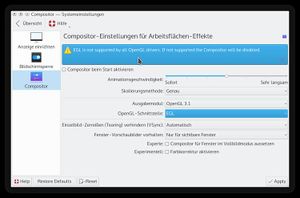
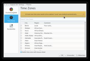
A ''message panel'' is a small pop-up panel shown at top of the current form that informs users of a non-critical problem or special condition | A ''message panel'' is a small pop-up panel shown at top of the current form that informs users of a non-critical problem or special condition. The panel shows information on four levels indicated by different colors and icons, and provides standard action that users might want to initiate. | ||
== Examples == | == Examples == | ||
== Guidelines == | == Guidelines == | ||
* Use | * Use message panel in cases of non-critical problems that user can solve. | ||
** Use ''negative feedback'' (aka error) as a secondary indicator of failure, e.g. if a transaction was not completed successfully | |||
** Show the information on a warning level in case of relevant information that do not concern the current workflow, e.g. No Internet connection available. | |||
** Use ''positive feedback'' to notify about user-initiated processes, e.g. to indicate completion of background tasks | |||
** Use ''opportunistic interaction'' (aka notification) to acknowledge the user about options that he or she might be interested in, e.g. "Remember password?" | |||
* Display the information immediately. | * Display the information immediately. | ||
* | * When users dismiss the panel, do not display any other UI or start any other side effect. | ||
* | * Do not add controls to the message panel other than action buttons for opportunistic interaction. | ||
** the | * Consider to show a [[Projects/Usability/HIG/Notifications|notification]] if Information does not concern the current workflow. | ||
== Is this the right control? / Behavior == | |||
* | === Negative feedback === | ||
* | |||
The KMessageWidget should be used as a secondary indicator of failure: the first | |||
indicator is for instance that the action the user expected to happen did not happen. | |||
Example: User fills a form, clicks "Submit". | |||
* Expected feedback: form closes | |||
* First indicator of failure: form stays there | |||
* Second indicator of failure: a KMessageWidget appears on top of the form, explaining the error condition | |||
When used to provide negative feedback, KMessageWidget should be placed close to its context. In the case of a form, it should appear on top of the form entries. | |||
KMessageWidget should get inserted in the existing layout. Space should not be | |||
reserved for it, otherwise it becomes "dead space", ignored by the user. | |||
KMessageWidget should also not appear as an overlay to prevent blocking access to elements the user needs to interact with to fix the failure. | |||
When used for negative feedback, do not offer a close button. The message panel only closes when the problem it informs about (e.g. the error) is fixed. | |||
=== Positive feedback === | |||
KMessageWidget can be used for positive feedback but it shouldn't be overused. It is often enough to provide feedback by simply showing the results of an action. | |||
Examples of acceptable uses: | |||
* Confirm success of "critical" transactions | |||
* Indicate completion of background tasks | |||
Example of wrong uses: | |||
* Indicate successful saving of a file | |||
* Indicate a file has been successfully removed | |||
=== Opportunistic interaction === | |||
Opportunistic interaction is the situation where the application suggests to the user an action he could be interested in perform, either based on an action the user just triggered or an event which the application noticed. | |||
Example use cases: | |||
* A browser can propose remembering a recently entered password | |||
* A music collection can propose ripping a CD which just got inserted | |||
* A chat application may notify the user a "special friend" just connected | |||
== Appearance == | |||
The KMessageWidget should provide two possible shapes: line and rectangle. | |||
==== Line ==== | |||
Example of layout for a negative feedback KMessageWidget: | |||
+----------------------------------------------+ | |||
| {X} Wrong username or password | | |||
+----------------------------------------------+ | |||
''{X} stands for the 'dialog-error' icon'' | |||
Example of layout for an opportunistic interaction KMessageWidget: | |||
+------------------------------------------------------------------------------+ | |||
| {i} Remember password for site example.com? (Remember) (Do not remember) (X) | | |||
+------------------------------------------------------------------------------+ | |||
The widget height is always the height of one line of text plus | |||
margins. If text is too long, it is cropped like this: | |||
+----------------------------------------------------------------------+ | |||
| {i} Remember password for... _more_ (Remember) (Do not remember) (X) | | |||
+----------------------------------------------------------------------+ | |||
Clicking on _more_ expands the widget to multiple lines: | |||
+----------------------------------------------------------------------+ | |||
| {i} Remember password for site (Remember) (Do not remember) (X) | | |||
| example.com? | | |||
+----------------------------------------------------------------------+ | |||
Note: One should try to ensure the beginning of the message text makes it | |||
possible for the regular user to understand the message without clicking on the | |||
_more_ link. So avoid generic introductions like "Do you want FooApp to...". | |||
==== Rectangle ==== | |||
Example usage: showing feedback at the bottom of a sidebar. | |||
+------------------------+ | |||
| {i} Do you want to (X) | | |||
| rip this CD? | | |||
| | | |||
| (Rip CD) | | |||
+------------------------+ | |||
Queuing: KMessageWidgets should not stack on each others. Assuming KMessageWidget | |||
A is visible, if KMessageWidget B is created, it should wait until A has been | |||
visible for at least 3 seconds and replace it. | |||
== Implementation == | == Implementation == | ||
Examples | |||
[[Image:kmessagewidget_info.jpg|300px]] | |||
[[Image:kmessagewidget_warning.jpg|300px]] | |||
[http://api.kde.org/frameworks-api/frameworks5-apidocs/kwidgetsaddons/html/classKMessageWidget.html KMessageWidget] | |||
cf. http://community.kde.org/Sprints/UX2011/KMessageWidget | |||
Revision as of 22:47, 11 January 2016
Purpose
A message panel is a small pop-up panel shown at top of the current form that informs users of a non-critical problem or special condition. The panel shows information on four levels indicated by different colors and icons, and provides standard action that users might want to initiate.
Examples
Guidelines
- Use message panel in cases of non-critical problems that user can solve.
- Use negative feedback (aka error) as a secondary indicator of failure, e.g. if a transaction was not completed successfully
- Show the information on a warning level in case of relevant information that do not concern the current workflow, e.g. No Internet connection available.
- Use positive feedback to notify about user-initiated processes, e.g. to indicate completion of background tasks
- Use opportunistic interaction (aka notification) to acknowledge the user about options that he or she might be interested in, e.g. "Remember password?"
- Display the information immediately.
- When users dismiss the panel, do not display any other UI or start any other side effect.
- Do not add controls to the message panel other than action buttons for opportunistic interaction.
- Consider to show a notification if Information does not concern the current workflow.
Is this the right control? / Behavior
Negative feedback
The KMessageWidget should be used as a secondary indicator of failure: the first indicator is for instance that the action the user expected to happen did not happen.
Example: User fills a form, clicks "Submit".
- Expected feedback: form closes
- First indicator of failure: form stays there
- Second indicator of failure: a KMessageWidget appears on top of the form, explaining the error condition
When used to provide negative feedback, KMessageWidget should be placed close to its context. In the case of a form, it should appear on top of the form entries.
KMessageWidget should get inserted in the existing layout. Space should not be reserved for it, otherwise it becomes "dead space", ignored by the user. KMessageWidget should also not appear as an overlay to prevent blocking access to elements the user needs to interact with to fix the failure.
When used for negative feedback, do not offer a close button. The message panel only closes when the problem it informs about (e.g. the error) is fixed.
Positive feedback
KMessageWidget can be used for positive feedback but it shouldn't be overused. It is often enough to provide feedback by simply showing the results of an action.
Examples of acceptable uses:
- Confirm success of "critical" transactions
- Indicate completion of background tasks
Example of wrong uses:
- Indicate successful saving of a file
- Indicate a file has been successfully removed
Opportunistic interaction
Opportunistic interaction is the situation where the application suggests to the user an action he could be interested in perform, either based on an action the user just triggered or an event which the application noticed.
Example use cases:
- A browser can propose remembering a recently entered password
- A music collection can propose ripping a CD which just got inserted
- A chat application may notify the user a "special friend" just connected
Appearance
The KMessageWidget should provide two possible shapes: line and rectangle.
Line
Example of layout for a negative feedback KMessageWidget:
+----------------------------------------------+
| {X} Wrong username or password               |
+----------------------------------------------+
{X} stands for the 'dialog-error' icon
Example of layout for an opportunistic interaction KMessageWidget:
+------------------------------------------------------------------------------+
| {i} Remember password for site example.com? (Remember) (Do not remember) (X) |
+------------------------------------------------------------------------------+
The widget height is always the height of one line of text plus margins. If text is too long, it is cropped like this:
+----------------------------------------------------------------------+
| {i} Remember password for... _more_ (Remember) (Do not remember) (X) |
+----------------------------------------------------------------------+
Clicking on _more_ expands the widget to multiple lines:
+----------------------------------------------------------------------+
| {i} Remember password for site      (Remember) (Do not remember) (X) |
|     example.com?                                                     |
+----------------------------------------------------------------------+
Note: One should try to ensure the beginning of the message text makes it possible for the regular user to understand the message without clicking on the _more_ link. So avoid generic introductions like "Do you want FooApp to...".
Rectangle
Example usage: showing feedback at the bottom of a sidebar.
+------------------------+
| {i} Do you want to (X) |
|     rip this CD?       |
|                        |
|               (Rip CD) |
+------------------------+
Queuing: KMessageWidgets should not stack on each others. Assuming KMessageWidget A is visible, if KMessageWidget B is created, it should wait until A has been visible for at least 3 seconds and replace it.
Implementation
Examples


