Projects/Usability/HIG/Form Label Alignment: Difference between revisions
(→Aligning Sub-Options: Fix numbering) |
(Refreshed checkbox section) |
||
| Line 23: | Line 23: | ||
== Checkboxes == | == Checkboxes == | ||
The text of a checkbox is on the right of its tick rectangle, which can make it difficult to avoid blank areas on the left side of the form. To keep the layout of the form balanced you can use one of the following approaches: | |||
1. Group checkboxes together in the widget column and add a label describing the group in the label column: | |||
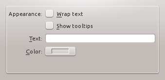
[[Image: | [[Image:Hig-grouped-checkboxes.png|frame|center|Grouped checkboxes]] | ||
2. Make the checkboxes span the two columns, but keep them at the bottom of the form: | |||
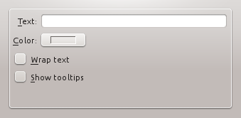
[[Image:Hig-two-column-checkboxes.png|frame|center|Checkboxes spanning two columns]] | |||
3. If all else fails, add a label describing the checkbox on the left side of the checkbox, then set the text of the checkbox to "Enabled", "On", or similar. | |||
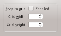
[[Image:Hig-checkbox-separate-label.png|frame|center|Using a separate title label for the checkbox.]] | |||
== Aligning Sub-Options == | == Aligning Sub-Options == | ||
Revision as of 12:47, 31 May 2013
Label Alignment
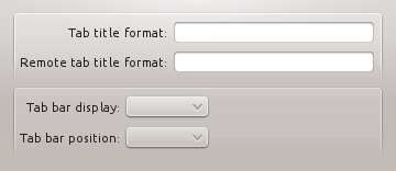
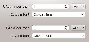
One of the new changes in KDE 4.x since KDE 3.x is the alignment of form and widget labels. In KDE 3.x, labels were aligned to the left and widgets were aligned to the left. In KDE 4, form labels are now aligned to the right and widgets are aligned to the left, making a group of form widgets appear to be center aligned. In Qt4, using a QFormLayout handles this correctly for you.
 |
 |
Dialog Alignment
In OSX, a group of widgets is center aligned. In KDE4, a group of widgets is left aligned. This aligns the labels closer to the left edge and makes use of space more efficiently.
 |
 |
The alignment of groups of widgets is independent, and so you may have different sized groups with different "centered" lines. A group of widgets consists of widgets within some type of natural separation such as a group box or separator bar.
Checkboxes
The text of a checkbox is on the right of its tick rectangle, which can make it difficult to avoid blank areas on the left side of the form. To keep the layout of the form balanced you can use one of the following approaches:
1. Group checkboxes together in the widget column and add a label describing the group in the label column:
2. Make the checkboxes span the two columns, but keep them at the bottom of the form:
3. If all else fails, add a label describing the checkbox on the left side of the checkbox, then set the text of the checkbox to "Enabled", "On", or similar.
Aligning Sub-Options
When options are subordinate to a checkbox or radiobutton (e.g. Audio level can only be set if the Activate Audio option is selected), this relation should be visualized by indenting the sub-options. There are two options to do so:
1. When you are using a left-aligned checkbox or radio button, indent the sub-options by using a horizontal spacer of SizeType "Minimum".

2. When you are using a checkbox that is placed right to its label, indent the sub-options in the same vertical axis as the checkbox.

The contents of this guideline are under discussion. Please request guidance in #kde-usability if you have any questions regardling Form Label Alignment
In some cases it may be useful to visually separate groups of related options within one GroupBox to facilitate scanning of the dialog.
In that case, put a vertical fixed size spacer of 16px height between the options.
Examples
[Screenshots of example dialog layouts simple and complex]
