Projects/Usability/HIG/Dialogs
Purpose
A dialog is a secondary window that allows users to perform a command, asks users a question, or provides users with information or progress feedback.
Dialogs can be modal and require users to complete and close before continuing with the owner window, or modeless, i.e. users can switch between dialogs and parent window.
Guidelines
Is this the right control?
- Use a dialog to structure the work flow. For instance, the functions Open, Save, Advanced Search need user input or confirmation. In particular, dialogs are expected by users for configuration.
- Do not use dialogs if the flow must not get interrupted. In this case prefer inline controls.
- Consider to use alternative ways for communication with users like tool-tip or message panel.
- Always use standard dialogs, if available.
Behavior
- Do not apply dialog boxes that require the use of a scroll bar.
- Do not include a menu bar or status bar in dialogs.
- Do not display more than one owned choice dialog at a time from an owner choice dialog.
- Always keep dialogs on top of their parent.
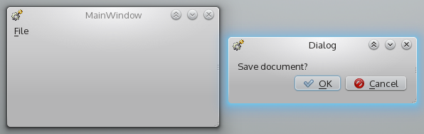
Bad 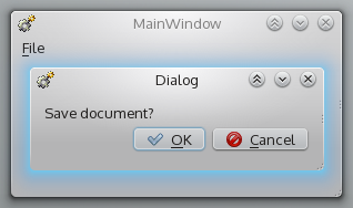
Good


- Set input focus on confirmation button by default. But set focus on disruptive button (Cancel, Don't apply or the like) if the dialog comprises of critical confirmation.
- Avoid to nest dialogs, especially in case of modal dialogs.
- Avoid dialogs that contain only one or two options. If possible, use direct selection or inline-editing instead.
- Do not use dialogs to display non-critical messages which do not require any further user interaction (typically dialogs with a single "OK" or "Close" button). Consider to use tool-tips or a message panel.
- Use modal dialogs only if allowing interaction with other parts of the application while the window is opened could cause data loss or some other serious problem.
- Provide a clear way of leaving the modal dialog, such as a Cancel button.
- When the dialog is used to inform about an unexpected condition that needs interaction, follow the guidelines for message dialogs.
Appearance
- Use tabbed dialogs when you have a limited number of tabs (max. 6). If you cannot see all the tabs without scrolling or splitting them into multiple rows, you are probably using too many and should use a paged dialog instead.
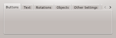
Bad 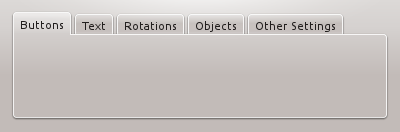
Good


- Always use paged dialogs for configuration dialogs - assuming that there is more than one section of options to be configured. For other dialogs, use paged dialogs if there are too many tabs to put them into a tabbed dialog.
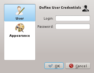
Good

- Dialogs should not be bigger than two thirds of the screen size and should always be resizable. Take care about high resolution displays (i.e. QXGA and more).
- Save and restore user adjustments of dialog size.
- Make sure there is at least one third white space, do not overload the panel.
- Consider the common reading direction from left to right and top to bottom.
- Dialogs are grouped in meaningful sections, for instance by group boxes. The actions are grouped along their context of use, not along technical relations.
- Provide a title to each section.
- Follow the guidelines for alignment.