Projects/Usability/HIG/CheckBox: Difference between revisions
m ([http://qt-project.org/doc/qt-4.8/qradiobutton.html QRadioButton] → {{qt|QRadioButton}}) |
|||
| (7 intermediate revisions by 2 users not shown) | |||
| Line 8: | Line 8: | ||
* Use check boxes for non-exclusive options that have clear alternatives. Mutually exclusive options should use a set of [[Projects/Usability/HIG/Radio_Buttons| radio buttons]] or a [[Projects/Usability/HIG/Combo_Box| combo box]]. | * Use check boxes for non-exclusive options that have clear alternatives. Mutually exclusive options should use a set of [[Projects/Usability/HIG/Radio_Buttons| radio buttons]] or a [[Projects/Usability/HIG/Combo_Box| combo box]]. | ||
* Do not use a check box if the opposite is ambiguous. | * Do not use a check box if the opposite is ambiguous. | ||
*: [[ | *: [[Image:Ambiguous_Opposite_Bad.png]] | ||
*: ↑ BAD: User has to guess what the opposite of "Landscape" is. | |||
*: [[Image:Ambiguous_Opposite_Good.png]] | |||
*: ↑ GOOD: Using two radio buttons instead of a check box removes the need to guess. | |||
* For more than five options, use either a [[Projects/Usability/HIG/ListView| list view]] or the [[Projects/Usability/HIG/SOU_Workspace/Two_Lists | dual-list pattern]] in case of multiple selections. | * For more than five options, use either a [[Projects/Usability/HIG/ListView| list view]] or the [[Projects/Usability/HIG/SOU_Workspace/Two_Lists | dual-list pattern]] in case of multiple selections. | ||
* Do not use the selection to perform commands. Consider using a [[../Buttons|push button]] instead. | * Do not use the selection to perform commands. Consider using a [[../Buttons|push button]] instead. | ||
| Line 34: | Line 37: | ||
** When you are using a check box that is placed right to its label, indent the sub-options in the same vertical axis as the check box. | ** When you are using a check box that is placed right to its label, indent the sub-options in the same vertical axis as the check box. | ||
**: [[Image:Suboption_right.png|frame|center|Aligning sub-options with the same vertical axis as the checkbox itself.]] | **: [[Image:Suboption_right.png|frame|center|Aligning sub-options with the same vertical axis as the checkbox itself.]] | ||
* If activating a choice affects the appearance or the enabled state of other controls, place them next to the check box (group). | |||
* Align check boxes vertically rather than horizontally, as this makes them easier to scan visually. Use horizontal or rectangular alignments only if they greatly improve the layout of the window. | |||
* If certain controls in a configuration dialog are only relevant if a certain check box is checked (i.e. they are dependent controls), disable them instead of hiding them if that check box is unchecked. | * If certain controls in a configuration dialog are only relevant if a certain check box is checked (i.e. they are dependent controls), disable them instead of hiding them if that check box is unchecked. | ||
* Do not separate check box and label. Clicking on both the box and the label should toggle the option. | |||
*: [[File:HIG_Checkbox5.png]] | |||
* Do not add line breaks. If necessary place an additional label below the check box. | * Do not add line breaks. If necessary place an additional label below the check box. | ||
*: [[File:HIG_Checkbox2.png]] | *: [[File:HIG_Checkbox2.png]] | ||
* | * Label a group of check box with a descriptive caption to the top left of the group (cf. [[Projects/Usability/HIG/Alignment| Alignment]]). | ||
* Create a buddy relation so access keys are assigned. | |||
* Use [[Projects/Usability/HIG/Capitalization|sentence style capitalization]] for check box items. | |||
* | |||
* Do not use ending punctuation (neither dot nor colon) for group label. | * Do not use ending punctuation (neither dot nor colon) for group label. | ||
== Implementation == | == Implementation == | ||
[ | {{qt|QCheckBox}} | ||
[[Category:Usability]] | |||
[[Category:Behavior|Check Box]] | |||
[[Category:Editing_and_Manipulation]] | |||
[[Category:Selection]] | |||
Revision as of 21:05, 3 August 2013
Purpose
A check box is a control that permits the user to make multiple selections from a number of options. Check boxes are used to toggle an option on or off, or to select or deselect an item. Users make a decision between two clearly opposite choices (on (vs. off), apply (vs. don't apply), show (vs. hide). etc.).
Example
Guidelines
Is this the right control
- Use check boxes for non-exclusive options that have clear alternatives. Mutually exclusive options should use a set of radio buttons or a combo box.
- Do not use a check box if the opposite is ambiguous.
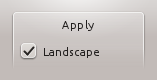
- ↑ BAD: User has to guess what the opposite of "Landscape" is.
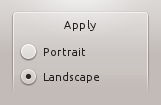
- ↑ GOOD: Using two radio buttons instead of a check box removes the need to guess.
- For more than five options, use either a list view or the dual-list pattern in case of multiple selections.
- Do not use the selection to perform commands. Consider using a push button instead.


Behavior
- Checking a check box should always "enable" an option or change the state of an option to "on". Checking a negative or disabling option is a double negative and causes confusion and errors.
- Use the mixed state only to indicate that an option is set for some, but not all, child objects. Mixed state must not be used to represent a third state.
- Users must not be able to set a mixed state directly.
- Clicking a mixed state check box enables all child objects.
- Do not use sliding switches in Desktop applications. They only offer good user interaction on touch screens, so they should only be used in applications for Plasma Active.

Appearance
- The text of a check box is on the right of its tick rectangle, which can make it difficult to avoid blank areas on the left side of the form. To keep the layout of the form balanced you can use one of the following approaches:
- Group check boxes together in the widget column and add a label describing the group in the label column.
Grouped checkboxes
- Make the check boxes span the two columns, but keep them at the bottom of the form. Remark: This interferes with other layout guidelines
Checkboxes spanning two columns
- If all else fails, add a label describing the checkbox on the left side of the checkbox, then set the text of the checkbox to "Enabled", "On", or similar.
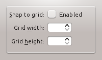
Using a separate title label for the checkbox.
- Group check boxes together in the widget column and add a label describing the group in the label column.
- When options are subordinate to a check box (e.g. Audio level can only be set if the Activate Audio option is selected), this relation should be visualized by indenting the sub-options. There are two options to do so:
- When you are using a left-aligned check box, indent the sub-options by using a horizontal spacer of SizeType "Minimum".
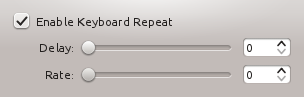
Aligning sub-options with a horizontal spacer of SizeType "Minimum".
- When you are using a check box that is placed right to its label, indent the sub-options in the same vertical axis as the check box.
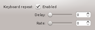
Aligning sub-options with the same vertical axis as the checkbox itself.
- When you are using a left-aligned check box, indent the sub-options by using a horizontal spacer of SizeType "Minimum".


- If activating a choice affects the appearance or the enabled state of other controls, place them next to the check box (group).
- Align check boxes vertically rather than horizontally, as this makes them easier to scan visually. Use horizontal or rectangular alignments only if they greatly improve the layout of the window.
- If certain controls in a configuration dialog are only relevant if a certain check box is checked (i.e. they are dependent controls), disable them instead of hiding them if that check box is unchecked.
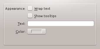
- Do not separate check box and label. Clicking on both the box and the label should toggle the option.
- Do not add line breaks. If necessary place an additional label below the check box.
- Label a group of check box with a descriptive caption to the top left of the group (cf. Alignment).
- Create a buddy relation so access keys are assigned.
- Use sentence style capitalization for check box items.
- Do not use ending punctuation (neither dot nor colon) for group label.

