Projects/Usability/HIG/Alignment: Difference between revisions
No edit summary |
|||
| Line 45: | Line 45: | ||
== Addendum == | == Addendum == | ||
* | * ColumnResizer: http://agateau.com/2011/01/28/clean-up-your-layouts-with-columnresizer/ | ||
[[Category:Usability]][[Category: Presentation]][[Category:Layout]] | [[Category:Usability]][[Category: Presentation]][[Category:Layout]] | ||
Revision as of 11:52, 9 January 2014
Purpose
One of the most important aspects of presentation is alignment and placement of controls. Its theoretical foundation is based on Gestalt psychology. Human perception tends to order experience in a manner that is regular, orderly, symmetric, and simple. Visual impression is generated to an emergent whole based on several principles, called Gestalt laws. Two basic laws are:
- Law of proximity: an assortment of objects that are close to each other are formed into a group
- Law of similarity: objects will be perceptually grouped together if they are similar to each other
Placement of controls should be carefully done according to Gestalt theory.
Guidelines
Labels
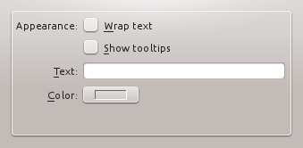
- Align labels to the right and connected widgets to the left, making a group of form widgets appear to be center aligned. In Qt4, using a QFormLayout handles this correctly for you.
 |
 |
Controls
- Align groups of items vertically rather than horizontally, as this makes them easier to scan visually. Use horizontal or rectangular alignments only if they greatly improve the layout of the window.
- Align a group of widgets to the left. This makes use of space more efficiently.
 |
|
- Left align controls over multiple groups (in case of right-to-left languages mirror the alignment). The visual anchor facilitates scanning of content, and left-hand alignment fits as well forms that have been oversized individually.
 |
 |
- Keep track on label size; avoid big differences in text length (even after translation), that could result in much white space for multiple aligned controls.
 |
- In some cases it may be useful to visually separate groups of related options within one group box to facilitate scanning of the dialog. In that case, put a vertical, fixed-size spacer of 16px height between the options.

Check boxes and Radio buttons
- Group check boxes or radio buttons together in the widget column and add a label describing the group in the label column.
Grouped checkboxes
- Make the check boxes or radio buttons span the two columns, but keep them at the bottom of the form.
Checkboxes spanning two columns
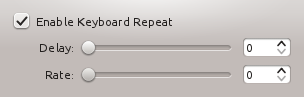
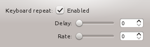
- If all else fails, add a label describing the checkbox on the left side of the checkbox, then set the text of the checkbox to "Enabled", "On", or similar.
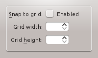
Using a separate title label for the checkbox.
- When options are subordinate to a check box or radio button (e.g. Audio level can only be set if the Activate Audio option is selected), this relation should be visualized by indenting the sub-options. There are two options to do so:
- When you are using a left-aligned check box, indent the sub-options by using a horizontal spacer of SizeType "Minimum".
Aligning sub-options with a horizontal spacer of SizeType "Minimum".
- When you are using a check box that is placed right to its label, indent the sub-options in the same vertical axis as the check box.
Aligning sub-options with the same vertical axis as the checkbox itself.
- When you are using a left-aligned check box, indent the sub-options by using a horizontal spacer of SizeType "Minimum".


