Projects/Usability/HIG/Settings
Appearance
Purpose
The settings dialog provides user-customizable options how an application or plasma (KCM) should behave. The dialog is intended for options that are not accessed frequently and are persitent. Following KDE's "Simple by default, powerful when needed" design mantra, settings are split into simple vs. advanced ones. Advanced settings are options that are not important to most users but essential for some, and can't removed therefore. Those options are hidden by default, but with an easy access in order to improve learnability.
Guidelines
Is this the right control
- Use this pattern for all settings that are relevant to change for users.
- Do not use the settings dialog for frequently accessed properties like, for instance, details vs. icon view. Use the toolbar or main menu (and optionally context menu) for these options.
- Do not use the settings dialog for rarely changed or developer options like the sql table name. Use extra configuration files or dialogs for those options.
General recommendations
- Simple by default: Define smart and polite defaults. Set the defaults in a way that most users don't have to alter them at all.
- Powerful when needed: Provide enough options for the perfect customization according individual needs and preferences. But even though customizability is very important for KDE software, try to keep your settings dialog as small and simple as possible. Remember: every option requires more code and more testing!
- Respect the privacy of the users: Always use opt-in, never an opt-out model for features that transmit potentially private data (e.g. usage statistics).
Layout
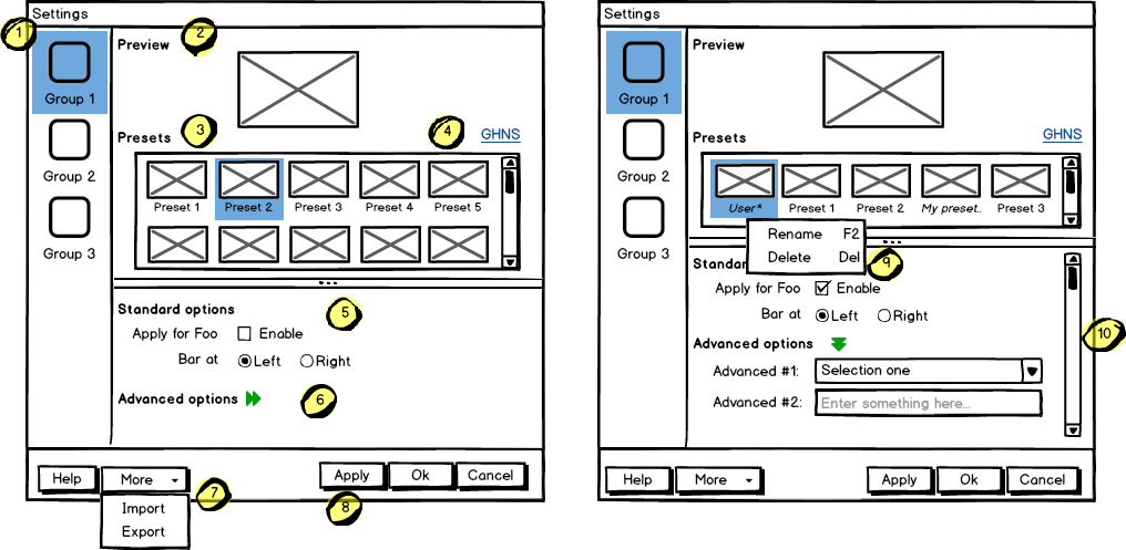
- Organize your settings in logical groups. (#1 in the example).
- Split options per group into standard and advanced. Make the standard easy to use for everyone. (#5)
- Offer several pre-defined profiles or schemes, and let the user decide what type of configuration should be active. (#3)
- Consider to add access to third-party profiles/schemes via Get Hot New Stuff! (use the label "Get New [term used for profile in your case]s"), if available for this group. (#4)
- Show a live preview for visual features. Omit this section if it's not relevant.
- Provide functions to export/import all settings. (#7) If splitting the options into app-related (such as colors, fonts, etc.) and account-related (for instance personal settings, mail accounts...) make sense, let the user decide what to export. Import has to as straightforward as possible; let the user just confirm when data are being overwritten.
Behavior
- When the user changes the default switch to a special profile ("User" or "Current"). This profile cannot be applied unless it is renamed individually. Access to rename (and delete) is done per context menu. Indicate user-defined profiles by using italic font for the name.
- Sort your options and groups by importance.
- When a change is applied, the application should adopt it immediately without the need to restart it.
- Do not change the settings dialog depending on the context. You should always start with the same landing page regardless of the application context.
- Do not use a wizard to edit options. Only use a wizard to set options if actually a group of options all have to be edited at once, eg creating an account or a first run wizard.
Mockup
- Access groups via sidebar.
- The preview has to be on the top of the content area.
- Offer a good number of pre-defined profiles/schmes to let the user choose one out of different factory settings. Anchor the profiles so that users can have more space for the area below using the horizontal splitter. Cut long captions with ellipsis and show the full name in a tooltip.
(Remark 1: The mockup has very large splitters. The implementation should be visually less obtrusive.)
(Remark 2: The profile selection replaces the former "reset (to default)" function.) - Allow users to add more profiles via Get Hot New Stuff (GHNS). Organize the setting in a way that GHNS access is per group and not global.
- Provide access to the most relevant settings at the Standard section. Make sure that these options are easy to understand.
- Indicate that Advanced options are available but keep this section collapsed by default. Use a descriptive label so that it reflects the functionality.
- Allow users to export the current settings to a file that can be easily imported on any other machine.
- Allow to Apply the current settings to the application without closing the dialog.
- Provide access to functions for user-defined profiles per context menu and standard shortcuts.
- Scroll the whole area of options but neither the preview not the profiles, if necessary.
Examples
^todo

