Projects/Usability/HIG/TreeView
Tree View
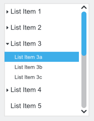
With a tree view users can view and interact with a hierarchically arranged collection of objects, using either single selection or multiple selections. In a tree, objects that contain data are called leaf nodes and objects that contain other objects are called container nodes. A single, top-most container node is called the root node.
A tree view is the appropriate control for items that have a single, natural, hierarchical categorization that's familiar to most users with more than two levels (not including the root node). But having hierarchical data doesn't mean a tree view must be used. Very often a list view or a combination of list view and drop-down list is a simpler, yet more powerful choice. The disadvantage of a tree view is that users may not completely understand the layout of the tree, but they will form a mental model of the relationships after interacting with the tree for a while. If that mental model is incorrect, it leads to confusion. The challenge when designing a tree is to balance discoverability with a predictable user model that minimizes confusion.
Guidelines
Is this the right control
- Apply a tree view to large data sets that can be categorized with two or more levels.
- Ideally, a tree should have no more than four levels (not counting the root node) and the most commonly accessed objects should appear in the first two levels.
- Use a natural hierarchical structure that's familiar to most users. Balance discoverability with a predictable user model that minimizes confusion.
- Consider to break down the hierarchical data, for instance into a selection by a drop-down list with an associated list view.
Behavior
- Start item’s default behavior with double click. Make double-click behavior redundant via button or context menu.
- Provide navigation by keys per directional arrows, plus Home, End, Page Up, and Page Down.
- Provide a context menu with relevant commands.
- Provide a root node only if users need the ability to perform commands on the entire tree.
- Users should always be able to expand and collapse container nodes by clicking the expander buttons.
- Apply a header with meaningful caption to columns.
- Avoid presenting empty trees.
- If the tree has alternative access methods such as a word search or an index, optimize the tree for browsing by focusing on the most useful content.
- Multi selection:
- Use check boxes to indicate the option for multiple selections.
- For check boxes, use the mixed state to indicate that an option is set for some, but not all, child objects. Users should not be able to set a mixed state directly (cf. check boxes).
- Clicking a mixed state check box selects all child objects and the parent check box.
- Don’t use check boxes in single selection trees.
Appearance
- If high-level containers have similar contents, consider using visual clues, e.g. icons to differentiate them.
- If users expand or collapse a container, make that state persist so it takes effect the next time the tree view is displayed, unless users are likely to prefer starting in the default state.
- Make the the control large enough that it can show at least eight items at a time without scrolling.
- Label the tree view with a descriptive caption to the top left (cf. alignment).
- Create a buddy relation so access keys are assigned.
- Do not use ending punctuation (neither dot nor colon) for caption.
- Use sentence style capitalization for tree view items.

