Projects/Usability/HIG/Presentation/DesignVisionPrinciples
Appearance
Purpose
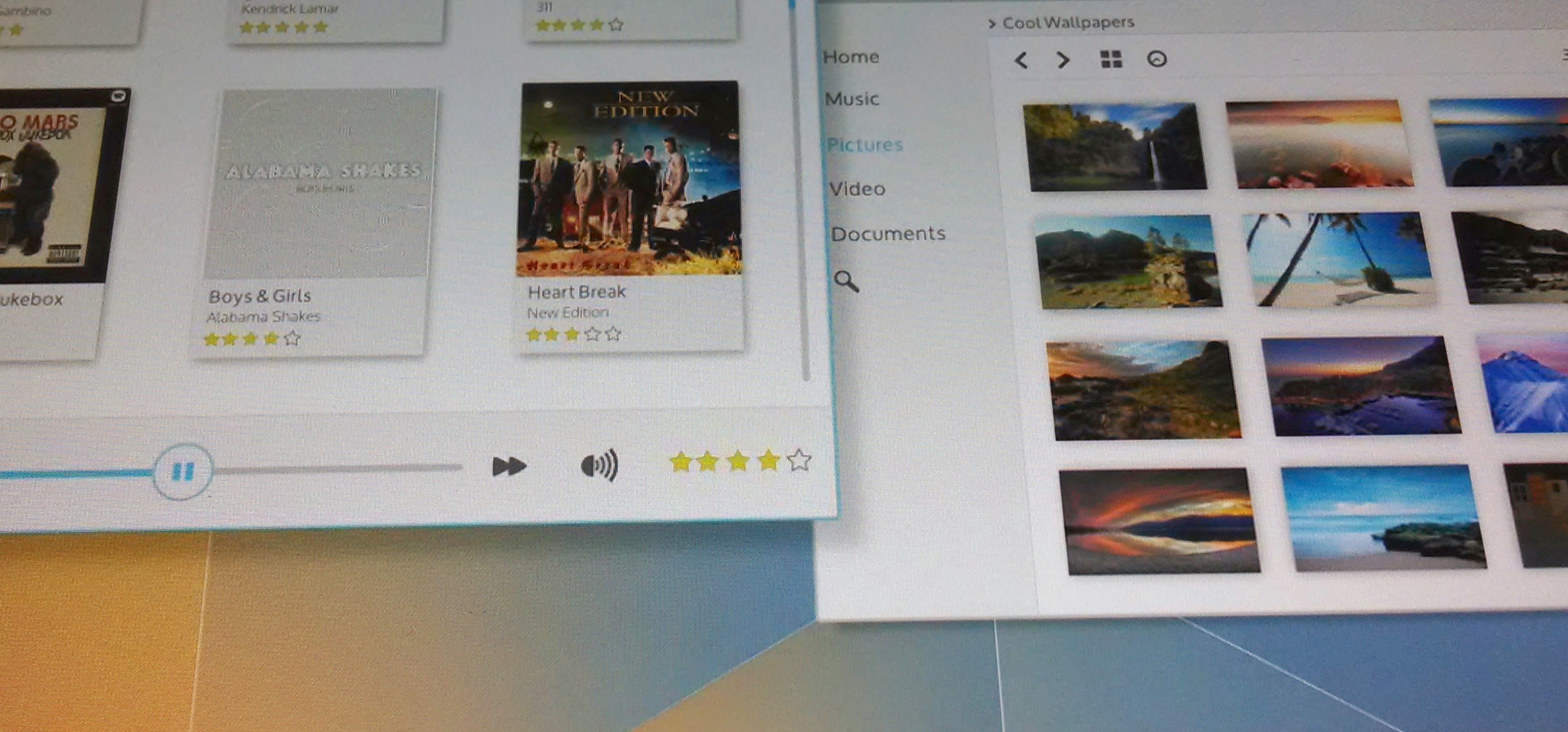
Visual design is driven at the highest level by a design vision. We rely on a set of design principles to fulfill that design vision. These principles guide all aspects of the visual design.
Guidelines
Design Vision
The future that never was; clean, technical, but human.
The design vision is focused on two attributes that connect the KDE community's past to it's future.
- Capable - Power and flexibility. KDE Applications and Workspaces allow users to be effortlessly creative and efficiently productive.
- Human - Simple and inviting. KDE Applications and Workspaces are pleasant to experience and easy to use.
Design Principles
The following design principles are used in support of the Design Vision.
- Capable
- Solve a problem. - Identify and make very clear to the user what need is addressed and how.
- Always in control. - It should always be clear what can be done, what is happening and what happened. The user should never feel at the mercy of the tool. Give the user the final say.
- Be flexible. - Provide sensible defaults but consider optional functionality or customizations that do not interfere with the primary task.
- Human
- Make it easy to focus on what matters. - Remove or minimize elements not crucial to the primary task. Use spacing to keep things uncluttered. Use color to draw attention.
- Make important things fast. - Not all actions are equal. Make important information or functions easy to find and use.
- I know how to do that! - Make things easier to learn by reusing design patterns from other applications.
- Do the heavy lifting for me. - Make complex tasks simple. Make novices feel like experts.
Elements of these guidelines have been adapted, per license, from Android Design.

