Projects/Usability/HIG/Toggle Buttons
Definition
A toggle button is a button which stays down when clicked once and goes up when clicked a second time.
When to Use
Use a toggle button to indicate a state.
Example: A word processor should use toggle buttons to indicate the state of "Bold", "Italic" or "Underline" formatting.
![]() (Toggle buttons used in a rich text editor)
(Toggle buttons used in a rich text editor)
When not to Use
Do not use a toggle button to indicate an action.
Example: A music player should not use a toggle button to implement a combined Play/Pause button. It should use a normal button and adjust the icon and label to represent the action which would be performed when clicked.
Icon and Label
There are two ways to label a toggle button:
First option: Describe the state which is reached when the button is down
In this case the icon and label should not change when the button is down.
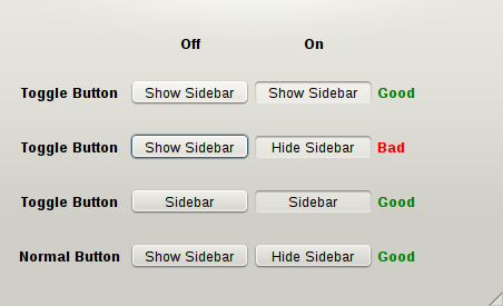
Example: We create a toggle button to toggle the visibility of a sidebar. The label of this button is "Show Sidebar". When the button is toggled down, it should still say "Show Sidebar": it should not be changed to "Hide Sidebar".
Think of the button as a check box: when you click a check box you do not expect its label to change. If it makes more sense to change the button text to "Hide Sidebar" when the sidebar is shown then you should use a normal button, not a toggle button.
It is worth noting that unlike normal buttons, the label of a toggle button does not need to contain a verb, as long as there is no ambiguity. In this example the label can be reduced to "Sidebar".
Second option: Describe the current state
In this case the label will often include a passive verb. For example a button to lock or unlock an element would say "Unlocked" when it is up and "Locked" when it is down. The icon should also change to match the label.


