Projects/Usability/HIG/Style/ColorSet
Appearance
Purpose
A consistent color set helps create a familiar visual language throughout the user interface.
Guidelines
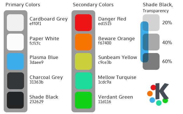
- Primary colors are used throughout the main interface of the applications and workspaces. Plasma Blue is used as the primary highlight color.
- Secondary colors are used sparingly as accents throughout the visual design.
- Where transparency is used (e.g. shadows) consider using the opacities listed.

