Projects/Usability/HIG/SearchPattern
Purpose
A search function allows to generate a subset out of a big number of items based on a user defined pattern. It can usually be applied to various sources and has several options for fine-tuning. Often search results needs further refinement by a filter.
Supplemental to search the filter function reduces the number of items. This operation works on the current list only and does not generate a new output. Filtering should always be instantaneous and must not interrupt the workflow. It makes sense to discriminate between a static filter that is part of the navigation and always shown, and a dynamic filter used for the current workflow.
Similar to filtering the operation might be used to highlight information. This preselection is a common feature in text processing and used to locate a particular piece of information without concealing the surrounding.
| Use case for filter vs. search |
|---|
| Jane has Dolphin open in her Documents folder. Let's say Jane has ~100 miscellaneous files there that have built up over the years. Jane also has under Documents several more structured folders with oodles of files as well for different projects over the years, travel expense reports and receipts. Jane thinks that the file she's looking for is one of those ~100 miscellaneous files because that where she typically put documents that aren't project or travel expense related. She thinks the filename starts with "sta" but isn't sure. So she opens the filter function on Dolphin and types "sta". What she expects is that out of ~100 files Dolphin shows in the Documents folder, some subset will be displayed with filenames starting with or containing "sta". She just wants to reduce the set of data that was already *visible* in Dolphin. She chose filter instead of search because she doesn't care about the 200 or so files in the Documents/Littlesburg Train Station project folder and its subfolders with "sta" in their filename.
She's essentially just restricting her search to what is currently *visible* and not trying to recursively search the contents of the currently displayed Documents folder. She's still conceptually searching. But how she's searching, even in the current folder, is quite different. |
Example

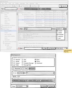
The example is based on KMail. To have both the static and dynamic filter in one application (which is not recommendable) the list of accounts can be reduced to a particular item. Combo boxes are enhanced by a checkbox list together with a caption that shows the selected items or, in case of not enough space, the number of selected items. The tooltipp lists all selections. The search dialog makes use of a dual list pattern.
Search
- Use a search function to generate results based on various sources with sufficient options.
- Always provide search function via extra secondary dialog.
Behavior
- Show hints on how to use the search effectively.
- Run a combined AND search when two words have been entered unless the term is quoted (e.g. Hello World vs "Hello World")
- Follow the guidelines on delayed operations if the search takes longer.
Appearance
- (Yet to be defined by the VDG)
Implementation
- (To be defined by devs)
Filter
- Apply filter to restrict the number of items of a list.
- Do not overload the simple filter function by options. If necessary, provide an additional search.
Behavior
- Perform filter operations always instantaneously.
- Make the operation as simple as possible. For instance, do not apply multi-dimensional filtering or do not use logical operators for input.
- Run operation case insensitive, unless it is important.
- Make input control large enough to show at least 20 characters.
- By default clear the filter input when the content is changed. But consider to provide a sticky function and keep the filter until it is cleared explicitly. With this option users do not need to research after selecting or referencing an item.
- Consider to provide auto complete feature to the input based on previous operations.
Appearance
- Show the filter pattern above the list of items.
- Use Ctrl+H to show/hide the input.
- Do not hide the input if the filter is an essential part of the application, i.e. when the list of items usually is large.
- If a Plasmoid or Plasma dialog has a filter capability, always show the filter bar since there is no menu to show or hide it.
- Show 'Search...' as place holder unless the control is focused.
Implementation
- (To be defined by devs)
Highlight
- Provide 'highlight search' when the content is relevant.
- Do not overload the simple highlight function by options. If necessary, provide an additional search.
Behavior
- Perform highlight operations always instantaneously.
- Make the operation as simple as possible. Do not add options.
- Run operation case insensitive.
- Make input control large enough to show at least 20 characters.
- Consider to provide auto complete feature to the input based on previous operations.
Appearance
- Place the input control at the bottom of the content area.
- Hide the input by default.
- Active the control and focus it on ctrl+F, and use F3/Shift+F3 to go to the next/previous item (cf. HIG about short-cuts).
Implementation
- (To be defined by devs)

