Projects/Usability/HIG/Style/Typography
Purpose
The guideline helps ensure that typography is always in harmony with the overall visual design.
Guidelines
Typeface Styles
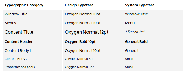
A selection of typeface styles are allocated throughout the user interface as follows. Set system defaults and conduct design activities using the design typeface styles. To respect user typeface choices while preserving the distinction afforded to each typographic category, implement the design using the corresponding system typeface styles.
- Note - For developers, it is recommended to use the system fonts available via KGlobalSettings. There is as yet no convenience function to get the Content Title font; however, you can use the KTitleWidget or the Plasma.TItle component for text labels since they use the correct Content Title font by default.
- A monospace version of the Content Body 1 typeface should be used for code content.
- Typography is treated like any other visual element when considering spacing and alignment.
- Limit the number of typeface style variations to about three in any single design.
- Multi-line blocks of text should be either left or right aligned; avoid center alignment for multi-line blocks of text.
- Point sizes correspond to actual typeface sizes at the default xorg 96 dpi setting, where 1 pt = 1/72 inch (0.35mm). Resize all visual elements, including type, when scaling the user interface for higher dpis.
- Limit the range of any dynamic type resizing to preserve the intended visual hierarchy. Dynamically resizing the type of a text element may alter the visual hierarchy. For example, don't resize body text till it's bigger than the heading text. Or don't resize the section heading text to fit more words until it's smaller than the body text for which it provides a heading. Or don't resize text of relatively less importance till it's bigger than text that should be relatively more important.
Typographic Category Examples
Menus - Menu bar, Popup menus
Content Title - Category title, Panel popups title
Content Header - Section headers
Content Body 1 - Text content, Icon grid items, List items
Content Body 2 - Captions , tooltips
Properties and Tools - Property panel, Toolbar, Status bar
Text Color and Contrast
The text color and background color can be varied to provide additional hierarchical hints (e.g. selected text). However, the contrast between the text and background color must be sufficient to preserve legibility of the text.
Words per line
Unless the content is long-form text like a book or a report, try to keep line lengths to no more than about eight to ten words per line. For typographic categories that use an all caps typeface, try to keep line lengths to no more than about three to four words per line.
Exceptions
When the visual design calls for an area of exceptional focus, a larger typeface size may be used. For a significantly larger typeface use a Light typeface weight to keep the stroke width similar to other typeface styles throughout the interface . All other typeface characteristics for the typographic category should be maintained. For such typeface exceptions to be effective, they must be rare.

