Projects/Usability/HIG/RadioButtons
Appearance
Purpose
Radio buttons offer the user a choice of two or more mutually exclusive options. Try to limit the number of radio buttons and radio button groups in a dialog. Offering a high number of radio buttons consumes screen space and adds to visual clutter. At the same time, showing all available options at once is an advantage if users are likely not to know possible alternatives.
Examples
Guidelines
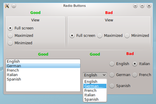
- Use radio buttons for a few mutually exclusive options. If there are more than five options (or if there is not enough space to arrange four or five options), use a combo box or list instead.
- If there are only two options where one is the negation of the other (e.g. "apply" vs. "do not apply"), consider replacing the radio buttons by one check box.
- Use radio buttons if the user should see the choices without further interaction.
- Provide a descriptive label above or left to a group of radio buttons in sentence style capitalization.
- Use title style capitalization the radio button options.
- Align groups of radio buttons vertically rather than horizontally, as this makes them easier to scan visually. Use horizontal or rectangular alignments only if they greatly improve the layout of the window.
- Radio buttons are not dynamic; their content or labels should not change depending on the context.
- If toggling a radio button affects the enabled state of other controls, place the controls that it affects next to the radio button or below and indented.
- Don't initiate an action when the user clicks a radio button.
- When using a radio button and none of the options is a valid choice, add another option to reflect this choice, such as None or Does not apply.
- Always have one radio button selected; make the first item the default option.
Code snippets
to be done

