Projects/Usability/HIG/Patterns/NavigationPatterns: Difference between revisions
Added mobile navigation patterns |
|||
| Line 1: | Line 1: | ||
==Purpose== | ==Purpose== | ||
Navigation Patterns depend on the structure of the application content. Navigation patterns can be combined with [[ | Navigation Patterns depend on the structure of the application content. Navigation patterns can be combined with [[../CommandPatterns|command patterns]] and content patterns to design the complete layout for your application. | ||
== | ==Patterns for desktop user interfaces== | ||
===Patterns for a flat content structure=== | ===Patterns for a flat content structure=== | ||
| Line 17: | Line 17: | ||
* These patterns are useful when each piece of content is meant to be shown one at a time. | * These patterns are useful when each piece of content is meant to be shown one at a time. | ||
* Controls are usually provided to allow the user to move from one piece of content to the next. | * Controls are usually provided to allow the user to move from one piece of content to the next. | ||
* Examples include a slideshow, or a video or music playlist, or a web browser. | * Examples include a slideshow, or a video or music playlist, or a single-page web browser. | ||
| Line 34: | Line 34: | ||
* These patterns are useful when multiple pieces of content are intended to be shown at once, alongside a larger, more complete presentation of the selected item. | * These patterns are useful when multiple pieces of content are intended to be shown at once, alongside a larger, more complete presentation of the selected item. | ||
* See the [[ | * See the [[../../Layout/Wizard|Wizard]] pattern guidelines for more details on using that pattern. | ||
* Examples include a contact list that shows the full details of the selected contact, a slideshow with a "film-strip" to select photographs, or setup for newly installed software | * Examples include a contact list that shows the full details of the selected contact, a slideshow with a "film-strip" to select photographs, or setup for newly installed software | ||
| Line 55: | Line 55: | ||
[[File:NP-2-deep-1a.png]] | [[File:NP-2-deep-1a.png]] | ||
* The Collapsible List pattern is a space-efficient way of showing 2-deep content. This pattern is useful for plasmoids and applications where the layout must be compact. A [[ | * The Collapsible List pattern is a space-efficient way of showing 2-deep content. This pattern is useful for plasmoids and applications where the layout must be compact. A [[../../TreeView|TreeView]] can be used to implement this pattern. | ||
* The Crossbar pattern arranges categories vertically and the content within the selected category horizontally. This pattern is often used for navigating video libraries. | * The Crossbar pattern arranges categories vertically and the content within the selected category horizontally. This pattern is often used for navigating video libraries. | ||
| Line 92: | Line 92: | ||
* Interaction is usually required to determine location relative to adjacent content on the previous level. | * Interaction is usually required to determine location relative to adjacent content on the previous level. | ||
* The pattern may also be applied to 2-deep and 3-deep content structures. | * The pattern may also be applied to 2-deep and 3-deep content structures. | ||
== Patterns for phone user interfaces == | |||
===Patterns for a flat content structure=== | |||
<span style="color:red">TODO: Wireframe</span> | |||
When pieces of application content are not grouped, the content structure is flat. | |||
* Examples include a playlist, a slideshow or a list of documents or contacts. | |||
'''SIngle item''' | |||
<span style="color:red">TODO: Wireframe: Media controls, Object with properties below, Object with properties in side-panel</span> | |||
* These patterns are useful when each piece of content is meant to be shown one at a time. | |||
* For media (dis)play, whether playback controls are shown depends on the type of media: | |||
** For audio, always show playback controls | |||
** For video, show playback controls only on tap (pausing the video) | |||
* For image galleries as well as playlists, use left/right swipe to switch between files to (dis)play | |||
* Display properties of the currently shown object which are essential for the application's main task below the object, show additional properties on demand in the [[../CommandPatterns/ContextPanel|Context Panel]] | |||
'''List''' | |||
<span style="color:red">TODO: Wireframe: List</span> | |||
* The list pattern is useful when multiple pieces of content are intended to be shown at once. | |||
* All essential information about each piece of content is visible or accessible within the list without changing layout. | |||
* If list items may be longer than one quarter of the list height, consider using an expandable list | |||
'''Expandable list '' | |||
<span style="color:red">TODO: Wireframe: Expandable list</span> | |||
* The collapsible list is useful when additional details for individual elements in a list/group are to be shown alongside the other elements in the list | |||
* For example, use the expandable list pattern for a list of emails in a thread to allow the user to show long individual mails in full while retaining easy navigation through the whole thread | |||
* Make only list items that are higher than 1/4 of the visible list height expandable | |||
* Tapping a list element once expands it, tapping it again collapses it | |||
'''List + detail view''' | |||
<span style="color:red">TODO: Wireframe</span> | |||
* The list + detail view pattern is useful when the user usually focuses on a single item in the list. | |||
* Tapping an item in the list shows its details in a new view | |||
* Use swipe left to go back to the list | |||
* Use a swipe beyond the top/bottom of the content to jump to the previous/next item in the list | |||
=== Patterns for a hierarchical structure === | |||
'''Column-based navigation''' | |||
<span style="color:red">TODO: Wireframe</span> | |||
* Use this pattern if there is a hierarchy of lists (e.g. Accounts -> Folders -> (Sub-Folders) -> Mails -> Invidual mail; Folders -> RSS Feeds -> Feed items -> Individual item, or the folder hierarchy of a file system). | |||
* Swiping left/right navigates one hierarchy level up/down | |||
* When on the lowest level, showing the content of an individual list item, use a swipe beyond the top/bottom of the content to jump to the previous/next item in the list | |||
Revision as of 00:14, 19 September 2015
Purpose
Navigation Patterns depend on the structure of the application content. Navigation patterns can be combined with command patterns and content patterns to design the complete layout for your application.
Patterns for desktop user interfaces
Patterns for a flat content structure
When pieces of application content are not grouped, the content structure is flat.
- Examples include a playlist, a slideshow or a list of documents or contacts.
SIngle item
- These patterns are useful when each piece of content is meant to be shown one at a time.
- Controls are usually provided to allow the user to move from one piece of content to the next.
- Examples include a slideshow, or a video or music playlist, or a single-page web browser.
Multiple items
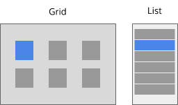
- These patterns are useful when multiple pieces of content are intended to be shown at once.
- All essential information about each piece of content is visible or accessible within the pattern without changing layout.
- If more space is needed to show the details of the selected item consider the Master-Detail patterns.
Master-Detail
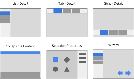
- These patterns are useful when multiple pieces of content are intended to be shown at once, alongside a larger, more complete presentation of the selected item.
- See the Wizard pattern guidelines for more details on using that pattern.
- Examples include a contact list that shows the full details of the selected contact, a slideshow with a "film-strip" to select photographs, or setup for newly installed software
Patterns for a 2-deep content structure
When all application content are grouped into top-level categories, the content structure is 2-deep.
- Examples include picture albums, music albums, email folders or tags.
Combination patterns
- Any two flat navigation patterns could be combined to create a 2-deep navigation pattern. However, to maintain visual consistency across applications we recommend always starting with the List-Detail pattern. A few examples are shown above.
Unique 2-deep patterns
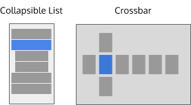
- The Collapsible List pattern is a space-efficient way of showing 2-deep content. This pattern is useful for plasmoids and applications where the layout must be compact. A TreeView can be used to implement this pattern.
- The Crossbar pattern arranges categories vertically and the content within the selected category horizontally. This pattern is often used for navigating video libraries.
Patterns for a 3-deep content structure
When all application content are grouped into categories, which are themselves be grouped into top-level categories, the content structure is 3-deep.
- Content structures this deep should generally be avoided.
- There are instances, however, where it may be difficult to avoid.
- Examples include a full music or video library or system settings.
Combination patterns
- As before, navigation patterns could be combined to create a 3-deep navigation pattern. However, to maintain consistency across applications, we recommend always starting with a List-Detail pattern with a Collapsible List. A few examples are shown above.
Patterns for n-deep content structures
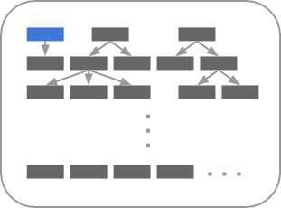
When content is infinitely groupable, the content is n-deep.
- Content structures this deep should be avoided. It is very difficult for the user to maintain awareness of their location in content structure relative to other content.
- There are instances, however, where this structure cannot be avoided.
- Examples include file systems and archives.
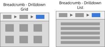
Breadcrumb patterns
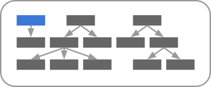
- These patterns provide awareness of the path within the content structure.
- Interaction is usually required to determine location relative to adjacent content on the previous level.
- The pattern may also be applied to 2-deep and 3-deep content structures.
Patterns for phone user interfaces
Patterns for a flat content structure
TODO: Wireframe
When pieces of application content are not grouped, the content structure is flat.
- Examples include a playlist, a slideshow or a list of documents or contacts.
SIngle item
TODO: Wireframe: Media controls, Object with properties below, Object with properties in side-panel
- These patterns are useful when each piece of content is meant to be shown one at a time.
- For media (dis)play, whether playback controls are shown depends on the type of media:
- For audio, always show playback controls
- For video, show playback controls only on tap (pausing the video)
- For image galleries as well as playlists, use left/right swipe to switch between files to (dis)play
- Display properties of the currently shown object which are essential for the application's main task below the object, show additional properties on demand in the Context Panel
List
TODO: Wireframe: List
- The list pattern is useful when multiple pieces of content are intended to be shown at once.
- All essential information about each piece of content is visible or accessible within the list without changing layout.
- If list items may be longer than one quarter of the list height, consider using an expandable list
'Expandable list
TODO: Wireframe: Expandable list
- The collapsible list is useful when additional details for individual elements in a list/group are to be shown alongside the other elements in the list
- For example, use the expandable list pattern for a list of emails in a thread to allow the user to show long individual mails in full while retaining easy navigation through the whole thread
- Make only list items that are higher than 1/4 of the visible list height expandable
- Tapping a list element once expands it, tapping it again collapses it
List + detail view
TODO: Wireframe
- The list + detail view pattern is useful when the user usually focuses on a single item in the list.
- Tapping an item in the list shows its details in a new view
- Use swipe left to go back to the list
- Use a swipe beyond the top/bottom of the content to jump to the previous/next item in the list
Patterns for a hierarchical structure
Column-based navigation
TODO: Wireframe
- Use this pattern if there is a hierarchy of lists (e.g. Accounts -> Folders -> (Sub-Folders) -> Mails -> Invidual mail; Folders -> RSS Feeds -> Feed items -> Individual item, or the folder hierarchy of a file system).
- Swiping left/right navigates one hierarchy level up/down
- When on the lowest level, showing the content of an individual list item, use a swipe beyond the top/bottom of the content to jump to the previous/next item in the list


