Projects/Usability/HIG/Dialogs: Difference between revisions
Appearance
→Positioning: Added screenshots. |
|||
| Line 4: | Line 4: | ||
::{| | ::{| | ||
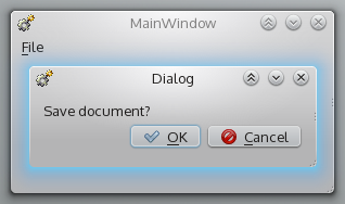
| [[Image:DialogPositionParentBad.png]] | | [[Image:DialogPositionParentBad.png]] | ||
| | | {{BadUsability}} | ||
|- | |- | ||
| [[Image:DialogsPositioningParentGood.png]] | | [[Image:DialogsPositioningParentGood.png]] | ||
| | | {{GoodUsability}} | ||
|} | |} | ||
::This is usually taken care of by the window manager. But in composed applications, focus problems may occur. Check carefully in this case. | ::This is usually taken care of by the window manager. But in composed applications, focus problems may occur. Check carefully in this case. | ||
Revision as of 18:02, 3 August 2013
Guidelines
Positioning
- Always keep dialogs on top of their parent.
- This is usually taken care of by the window manager. But in composed applications, focus problems may occur. Check carefully in this case.
- If reference in the parent window is required, make sure your dialog does not cover relevant parts.
For example a find dialog should neither be centered, nor cover a search result.
Interaction
- Set input focus on confirmation button.
Reduce the dialog flood
- Do not nest dialogs more than two levels deep.
For example "Configuration dialog > Advanced dialog" is ok, "Configuration dialog > Advanced dialog > Further settings dialog" is too deep. - Avoid dialogs that contain only one or two options. If possible, use inline-editing instead.
- Do not use dialogs to display non-critical messages which do not require any further user interaction (typically dialogs with a single "OK" or "Close" button). Use info panels instead.
Modal dialogs
- Use modal dialogs only if allowing interaction with other parts of the application while the window is opened could cause data loss or some other serious problem.
- Provide a clear way of leaving the modal dialog, such as a Cancel button.
Dialog Layout
- Dialogs should not be bigger than 800x600 pixels and should always be resizable
- Make sure there is at least one third white space, do not overload the panel.
- The reading direction in dialogs is left to right, top to bottom.
- Dialogs are grouped in meaningful sections. The actions are grouped along their context of use, not along technical relations.
- Each section has a title.
- Labels are right-aligned, input widgets are left aligned.
- Provide one or two major vertical axis in your dialog that guide the user's attention.
The vertical line where the right aligned labels and the left aligned input widgets meet is one such example. - Widgets which are subordinate to another widget are indented. If their enabled state depends on the parent widget, create an appropriate slot.
Otherwise, follow the guidelines described in Form: Label Alignment


