Projects/Usability/HIG/Tabs Pages: Difference between revisions
→Tabbed Dialogs: Use new screenshots |
|||
| Line 14: | Line 14: | ||
If you cannot see all the tabs without scrolling or splitting them into multiple rows, you are probably using too many and should use a paged dialog instead. | If you cannot see all the tabs without scrolling or splitting them into multiple rows, you are probably using too many and should use a paged dialog instead. | ||
[[File: | [[File:Tabs_good.png]] | ||
GOOD | |||
[[File:Tabs_bad.png]] | |||
BAD | |||
===Paged Dialogs=== | ===Paged Dialogs=== | ||
Revision as of 17:02, 19 June 2013
Tabs and Pages in Dialogs
General Guidelines
If a control affects only one tab or page in the dialog, place it on that tab/page. If it affects every tab/page in the dialog, place it outside, for example beside the window's OK and Cancel buttons.
Make sure changes on one tab will not change options on another tab.
Tabbed Dialogs
When to Use
Use tabbed dialogs when you have a limited number of tabs (max. 6). If you cannot see all the tabs without scrolling or splitting them into multiple rows, you are probably using too many and should use a paged dialog instead.
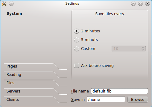
Paged Dialogs
When to Use
Always use paged dialogs for configuration dialogs - assuming that there is more than one section of options to be configured. For other dialogs, use paged dialogs if there are too many tabs to put them into a tabbed dialog.
Accessibility
Do not assign accelerator keys to tab and paged dialog labels. Assign an access key to every other control on each page, however.


