Projects/Usability/HIG/Toggle Buttons: Difference between revisions
No edit summary |
No edit summary |
||
| Line 23: | Line 23: | ||
Example: A toggle button to show/hide a sidebar can be labeled either "Show Sidebar" or simply "Sidebar". | Example: A toggle button to show/hide a sidebar can be labeled either "Show Sidebar" or simply "Sidebar". | ||
=== | ===Icon and Label=== | ||
In most cases one should never change the icon or label of a toggle button. A toggle button is very similar to a check box and should thus behave in the same way. The fact that it is pressed down is enough to indicate the current state of the element it represents. | |||
It may make sense in some case to change the icon to reflect the '''current''' state. Think of it like an outdoor light switch with an embedded led to indicate whether the outdoor light is on. | |||
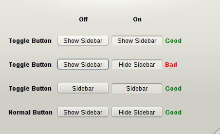
In the "Sidebar" example, "Show Sidebar" should not be turned into "Hide Sidebar" when the sidebar is visible. If you consider it more explicit to change the icon and label of your button then you should use a normal button, not a toggle button. | |||
[[File:Toggle-button-summary.png]] | [[File:Toggle-button-summary.png]] | ||
Revision as of 21:38, 18 August 2010
Definition
A toggle button is a button which stays down when clicked once and goes up when clicked a second time.
When to Use
Use a toggle button to indicate a state.
Example: A word processor should use toggle buttons to indicate the state of "Bold", "Italic" or "Underline" formatting.
When not to Use
Do not use a toggle button to indicate an action.
Example: A music player should not use a toggle button to implement a Play/Pause button. It should use a normal button and adjust the icon and label to represent the action which would be performed when clicked.
How to Use
Label Wording
Label of toggle buttons can often be reduced to a "noun only" form instead of the classic "verb (+ noun)" used with classic buttons. The "noun only" form should be favored over the "verb (+ noun)" form whenever it does not cause any ambiguity as this form reduces clutter.
Example: A toggle button to show/hide a sidebar can be labeled either "Show Sidebar" or simply "Sidebar".
Icon and Label
In most cases one should never change the icon or label of a toggle button. A toggle button is very similar to a check box and should thus behave in the same way. The fact that it is pressed down is enough to indicate the current state of the element it represents.
It may make sense in some case to change the icon to reflect the current state. Think of it like an outdoor light switch with an embedded led to indicate whether the outdoor light is on.
In the "Sidebar" example, "Show Sidebar" should not be turned into "Hide Sidebar" when the sidebar is visible. If you consider it more explicit to change the icon and label of your button then you should use a normal button, not a toggle button.

