Projects/Usability/HIG/SOU Workspace/Supplemental Information: Difference between revisions
Appearance
New page: Sometimes additional Information has to be given to the user to allow him/her to correctly use a widget/form/dialog or to warn of possibly harmful settings. ==Guidelines== There are thre... |
No edit summary |
||
| Line 19: | Line 19: | ||
*If the note/instruction concerns a group of widgets, place it at the top of the group, but inside it's frame | *If the note/instruction concerns a group of widgets, place it at the top of the group, but inside it's frame | ||
*If the note/instruction concerns a single widget, place it above the widget. Place it closer to the widget concerned than to the one above to make the connection clear | *If the note/instruction concerns a single widget, place it above the widget. Place it closer to the widget concerned than to the one above to make the connection clear | ||
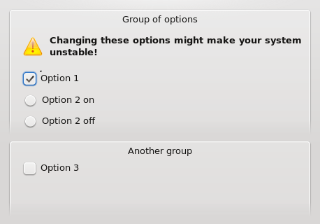
[[Image:Info group.png|Example of supplemental information on a group of options]] | |||
''Supplemental information (in this case a warning) given on a group of options'' | |||
===Tooltips=== | ===Tooltips=== | ||
Revision as of 11:38, 22 September 2008
Sometimes additional Information has to be given to the user to allow him/her to correctly use a widget/form/dialog or to warn of possibly harmful settings.
Guidelines
There are three ways to provide additional information in KDE4:
- Additional Text directly on the interface
- Tooltips
- The "What's this?"-Function (?-Icon)
Additional UI-Text
Use this method if
- most users are likely to need the information to correctly use a widget or a whole dialog/form
- the window in which it is displayed is not used regularly
- or if the user has to be warned of potentially harmful actions before using the widget
- If the note/instruction concerns the entire dialog or form, place it below it's title with at least one text-height of space above and below it. Display an information/warning-icon before the text
- If the note/instruction concerns a group of widgets, place it at the top of the group, but inside it's frame
- If the note/instruction concerns a single widget, place it above the widget. Place it closer to the widget concerned than to the one above to make the connection clear
Supplemental information (in this case a warning) given on a group of options
Tooltips
Use this method if
- many users need the information, but only the first time they are using the dialog/form
- Users are unlikely to be hovering the cursor over the widget unless they are looking for additional information
- The description can be short (no more then 25 words)
The "What's this?"-Function
Use this method if
- only few users are likely to need the information
- or if users are likely to often hover the cursor over a widget, thus making tooltips annoying
- the description would be too long for a tooltip

