Projects/Usability/HIG/Patterns/CommandPatterns: Difference between revisions
Added command patterns for mobile |
Changed side-panel to drawer |
||
| Line 67: | Line 67: | ||
* If there are controls that need to be accessed often within the application's primary tasks but the content needs as much space to be available as possible, put the main controls in a toolbar. | * If there are controls that need to be accessed often within the application's primary tasks but the content needs as much space to be available as possible, put the main controls in a toolbar. | ||
* The toolbar is at the top of the user interface and should not contain more than four buttons. | * The toolbar is at the top of the user interface and should not contain more than four buttons. | ||
* If there are more then four actions, put the remaining ones in the menu | * If there are more then four actions, put the remaining ones in the menu drawer or context drawer (see below) | ||
=== Patterns for global on-demand controls === | === Patterns for global on-demand controls === | ||
Drawers do not take away any room from the content, but need an extra action to access, and should therefore not be used for controls that are part of an application's main tasks. | |||
'''Menu | '''Menu drawer''' | ||
<span style="color:red">TODO: Wireframe</span> | <span style="color:red">TODO: Wireframe</span> | ||
The menu | The menu drawer (on the left side in the default setting) is used for global, context-independent controls. | ||
* The | * The drawer is opened by an edge-swipe and closed by swiping in the other direction or tapping outside of the panel | ||
* Do not use other controls then [[../../Menu_Bar]], [[../../Buttons]] or [[../../Toggle_Buttons]] in the | * Do not use other controls then [[../../Menu_Bar]], [[../../Buttons]] or [[../../Toggle_Buttons]] in the drawer | ||
'''Context | '''Context drawer''' | ||
<span style="color:red">TODO: Wireframe</span> | <span style="color:red">TODO: Wireframe</span> | ||
The context | The context drawer (on the right side in the default setting) is used for context-specific controls that affect only the currently selected object (e.g. copy, delete etc.). | ||
* The | * The drawer is opened by an edge-swipe and closed by swiping in the other direction or tapping outside of the panel | ||
* The context | * The context drawer contains only a list of actions, do not place any other controls in there | ||
** Do not use a nested structure in the context | ** Do not use a nested structure in the context drawer | ||
Revision as of 01:45, 19 September 2015
Purpose
Command patterns are determined by the command structure chosen for the application. A command is any function performed by the application based on user input. Commands that perform similar functions may be grouped together. The collection of commands and command groups make up the command structure of the application.
Command patterns can be combined with navigation patterns and content patterns to design the complete layout for your application.
Guidelines
When designing an application, it may be unclear what the command structure should be.
- Start by assuming a simple command structure and select an associated command pattern.
- As the design evolves, if the selected pattern becomes inadequate for completing the primary tasks of the application, consider a pattern for a more complex command structure.
Patterns for desktop user interfaces
Patterns for a simple command structure
- Use Menu Button command pattern when there are few globally applicable commands. The menu button can overlay content.
- Use Context Menu or Context Panel command patterns for commands specific to selected or currently visible content.
- The menu button pattern can be combined with either of the context menu or context panel patterns.
- Commands can also be exposed by direct manipulation of content (click, drag, buttons, search field, pan, zoom, etc).
- For plasmoids, all commands must be exposed by direct manipulation of content - no menu button, context menu, or context panel.
Examples
Contacts, Chat client, Video conference, Calculator, Terminal, Plasmoids (panel applets and desktop widgets), Maps, Games, Image browser, Document viewer, Music player, Video player, Software installer, System Settings
Patterns for a complex command structure
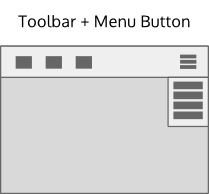
- Use Toolbar + Menu Button command pattern when the number of frequently used commands are about 8 or less, and the remaining commands are not essential to performing the primary task of the application. The toolbar pattern exposes the frequently used commands. The menu button pattern exposes more of the command structure.
- Commands are also exposed using context menus, a context panel or by the direct manipulation of content.
Examples
Web browser, File manager, Text editor, Email, Calendar, Image editor, Music player, Archiver
Patterns for a very complex command structure
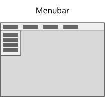
- Use the Menubar pattern when access to the full command structure is necessary to complete the primary tasks of the application.
- Commands are also exposed using toolbars, context menus, a context panel or by direct manipulation of content.
- Commands in the menubar should generally be globally applicable. Consider using a context panel or a context menu for commands that are specific to the current selection.
Examples
IDE, Text Editor(high-feature), Image editor(high-feature), Audio/video editor, Document editor(high-feature), Spreadsheet editor
Patterns for phone user interfaces
Considering the limited space available in mobile applications, there is always a trade-off between accessibility of controls and space available for the content
Patterns for direct actions
Controls within content
TODO: Wireframe
If controls are directly necessary for the primary tasks of an application (e.g. the "take photo" button in a camera app) and there is space left in the content area, put them directly within the content.
Toolbar
TODO: Wireframe
- If there are controls that need to be accessed often within the application's primary tasks but the content needs as much space to be available as possible, put the main controls in a toolbar.
- The toolbar is at the top of the user interface and should not contain more than four buttons.
- If there are more then four actions, put the remaining ones in the menu drawer or context drawer (see below)
Patterns for global on-demand controls
Drawers do not take away any room from the content, but need an extra action to access, and should therefore not be used for controls that are part of an application's main tasks.
Menu drawer
TODO: Wireframe
The menu drawer (on the left side in the default setting) is used for global, context-independent controls.
- The drawer is opened by an edge-swipe and closed by swiping in the other direction or tapping outside of the panel
- Do not use other controls then Projects/Usability/HIG/Menu_Bar, Projects/Usability/HIG/Buttons or Projects/Usability/HIG/Toggle_Buttons in the drawer
Context drawer
TODO: Wireframe
The context drawer (on the right side in the default setting) is used for context-specific controls that affect only the currently selected object (e.g. copy, delete etc.).
- The drawer is opened by an edge-swipe and closed by swiping in the other direction or tapping outside of the panel
- The context drawer contains only a list of actions, do not place any other controls in there
- Do not use a nested structure in the context drawer


