Projects/Usability/HIG/Alignment: Difference between revisions
Appearance
No edit summary |
|||
| Line 27: | Line 27: | ||
* If activating a choice affects the appearance or the enabled state of other controls, place them next to it with a space indentation. | * If activating a choice affects the appearance or the enabled state of other controls, place them next to it with a space indentation. | ||
* If the control appears in a dialog or utility window, consider making the window and the control within it resizeable so that the user can choose how many items are visible at a time without scrolling. Each time the user opens this dialog, set its dimensions to those that the user last resized it to. | * If the control appears in a dialog or utility window, consider making the window and the control within it resizeable so that the user can choose how many items are visible at a time without scrolling. Each time the user opens this dialog, set its dimensions to those that the user last resized it to. | ||
* For check boxes (and radio buttons as well), see the [[Projects/Usability/HIG/Check_Box|special guidelines]] at the appropriate page. | |||
== Addendum == | == Addendum == | ||
Revision as of 15:36, 2 January 2014
Purpose
One of the most important aspects of presentation is alignment and placement of controls. Its theoretical foundation is based on Gestalt psychology. Human perception tends to order experience in a manner that is regular, orderly, symmetric, and simple. Visual impression is generated to an emergent whole based on several principles, called Gestalt laws. Two basic laws are:
- Law of proximity: an assortment of objects that are close to each other are formed into a group
- Law of similarity: objects will be perceptually grouped together if they are similar to each other
Placement of controls should be carefully done according to Gestalt theory.
Discussion
Guidelines
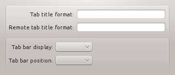
- Align labels to the right and connected widgets to the left, making a group of form widgets appear to be center aligned. In Qt4, using a QFormLayout handles this correctly for you.
 |
 |
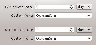
- Align a group of widgets to the left. This makes use of space more efficiently.
 |
 |
- The alignment of groups of widgets is independent, and so you may have different sized groups with different "centered" lines. A group of widgets consists of widgets within some type of natural separation such as a group box or separator bar. Remark: Matter of discussion

- In some cases it may be useful to visually separate groups of related options within one group box to facilitate scanning of the dialog. In that case, put a vertical, fixed-size spacer of 16px height between the options.

- Align groups of items vertically rather than horizontally, as this makes them easier to scan visually. Use horizontal or rectangular alignments only if they greatly improve the layout of the window.
- Create a buddy relation with the caption so access keys are assigned.
- If activating a choice affects the appearance or the enabled state of other controls, place them next to it with a space indentation.
- If the control appears in a dialog or utility window, consider making the window and the control within it resizeable so that the user can choose how many items are visible at a time without scrolling. Each time the user opens this dialog, set its dimensions to those that the user last resized it to.
- For check boxes (and radio buttons as well), see the special guidelines at the appropriate page.
Addendum
- Legacy page: Forms: Label Alignment

