Projects/Usability/HIG/SOU Workspace/Edit List: Difference between revisions
Beccascollan (talk | contribs) No edit summary |
No edit summary |
||
| Line 8: | Line 8: | ||
Determine when the user will need to access the pool of available items. | Determine when the user will need to access the pool of available items. | ||
If the typical user in a typical context will need to know what items are selected, but is unlikely to add or remove items from the list, use the [[#Picker Dialog|Picker Dialog]]. | |||
If it is likely that the items will be changed on a regular basis, use [[#Two Lists with Arrow Buttons|Two Lists with Arrow Buttons]]. | |||
==== Picker Dialog ==== | ==== Picker Dialog ==== | ||
A group of items that is displayed regularly but is changed (items being added or removed) only rarely is available to the user. Because of the infrequency of use, save valuable screen space by only showing the full list of items on demand. | A group of items that is displayed regularly but is changed (items being added or removed) only rarely is available to the user. Because of the infrequency of use, save valuable screen space by only showing the full list of items on demand. | ||
[[Image:Picker3.png]] | [[Image:Picker3.png]] | ||
| Line 42: | Line 44: | ||
The user may choose to select from a pool of items on a regular basis. Two lists are used so that the user can see the list of available items and the list of current items simultaneously. | The user may choose to select from a pool of items on a regular basis. Two lists are used so that the user can see the list of available items and the list of current items simultaneously. | ||
[[Image:twoLists2.png]] | [[Image:twoLists2.png]] | ||
Revision as of 17:41, 22 September 2008
Summary
The user has to select from a pool of items or options. What items are displayed and their order or sequence may have some relevance to the user.
In some cases this list must be accessed on a regular basis, on others very rarely.
Solution
Determine when the user will need to access the pool of available items.
If the typical user in a typical context will need to know what items are selected, but is unlikely to add or remove items from the list, use the Picker Dialog.
If it is likely that the items will be changed on a regular basis, use Two Lists with Arrow Buttons.
Picker Dialog
A group of items that is displayed regularly but is changed (items being added or removed) only rarely is available to the user. Because of the infrequency of use, save valuable screen space by only showing the full list of items on demand.
A list of items from which a picker dialog is launched.
- The target list is not directly editable. Provide an "edit" or "add" button at the bottom left of the list.
- If the order of available items can be changed, provide up/down buttons to the bottom right of the list. Drag and drop may also be used in addition.
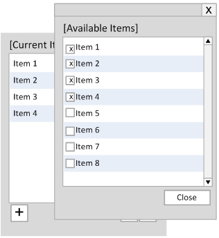
The Picker Dialog displayed.
- On clicking the "edit" or "add" button the Picker Dialog is displayed above the target list while ensuring that the target list can still be viewed.
- The Picker Dialog includes:
- the complete list of available items
- a title of the available items located at the top of the list
- a checkbox for each item to the left of the item name (see Rich Lists if more information must be displayed)
- a close button to the bottom right of the dialog
- Upon selecting a checkbox the item is immediately displayed in the target list.
Two Lists with Arrow Buttons
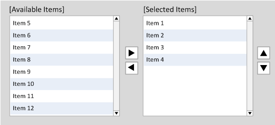
The user may choose to select from a pool of items on a regular basis. Two lists are used so that the user can see the list of available items and the list of current items simultaneously.
Optional items include scrollbars and a drop-down list if available items must be categorized. The buttons used to sort the target list should only used if the list is sortable and it makes sense to sort it.
- The list of all available items is on the left.
- The list of current items in the order they exist is on the right.
- Ensure that the list boxes are of equal height and width.
- Place move/remove buttons (right and left arrows) centered and in between the two lists.
- Items are moved from the available pool of items to the list of current items.
- The buttons to move items left and right are sensitive to the item selection and disabled if no items are selected.
- If an instance of one item can be repeated (such as a spacer), copy (rather than move) the item from the available pool of items to the list of current items.
- Multiple selection is possible, but only items in one list can be selected at a time.
- Drag & drop between the boxes is allowed in addition to the move/remove buttons.
- Double-clicking an item has the same effect as pressing the corresponding button.
- If the list of current items can be reordered, place up/down buttons to the right of the list of current items.
- Only enable the up/down buttons when an item is selected and can be moved.
- Drag and drop may also be used in addition to reorder the list.


