Projects/Usability/HIG/SOU Workspace/Picker: Difference between revisions
Appearance
Beccascollan (talk | contribs) No edit summary |
Beccascollan (talk | contribs) No edit summary |
||
| Line 8: | Line 8: | ||
[[Image:PickerList1.png]] | [[Image:PickerList1.png]] | ||
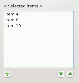
''A list of items from which a picker dialog is launched.'' | ''A list of items from which a picker dialog is launched.'' | ||
| Line 14: | Line 15: | ||
[[Image:PickerList2.png]] | [[Image:PickerList2.png]] | ||
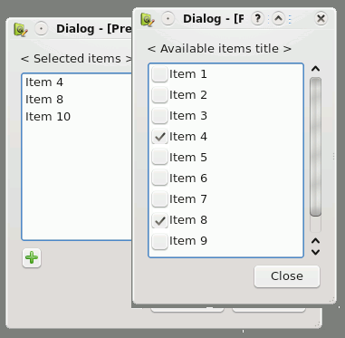
''The Picker Dialog displayed.'' | ''The Picker Dialog displayed.'' | ||
Revision as of 20:05, 2 September 2008
Picker Dialog
Summary
A group of items that might be changed on a rare occasion (such as added, removed or re-ordered) is available to the user. Because of the infrequency of use, save valuable screen space by only showing the full list of items on demand.
Solution
A list of items from which a picker dialog is launched.
- The target list is not directly editable. Provide an "edit" or "add" button at the bottom left of the list.
- If the order of available items can be changed, provide up/down buttons to the bottom right of the list. Drag and drop may also be used in addition.
The Picker Dialog displayed.
- On clicking the "edit" or "add" button the Picker Dialog is displayed above the target list while ensuring that the target list can still be viewed.
- The Picker Dialog includes:
- the complete list of available items
- a title of the available items located at the top of the list
- a checkbox for each item to the left of the item name (see Rich Lists if more information must be displayed)
- a close button to the bottom right of the dialog
- Upon selecting a checkbox the item is immediately displayed in the target list.


