Projects/Usability/HIG/Form Label Alignment: Difference between revisions
new content |
No edit summary |
||
| Line 21: | Line 21: | ||
=== Problems with QT 4 === | === Problems with QT 4 === | ||
The checkbox widget in QT 4 is the input click box on the left and the label on the right. Unfortunately, it difficult to create a checkbox with a label on the right of the input click box. This is a problem because there are common cases when the label on the left of the input click box is better usability. Until there is a resolution that makes configuring the checkbox label to the left of the input click box easier, use the default checkbox alignment (right aligned label). | The checkbox widget in QT 4 is the input click box on the left and the label on the right. Unfortunately, it difficult to create a checkbox with a label on the right of the input click box. This is a problem because there are common cases when the label on the left of the input click box is better usability. Until there is a resolution that makes configuring the checkbox label to the left of the input click box easier, use the default checkbox alignment (right aligned label), or if possible, put a right-aligned label next to the checkbox, and set the label of the checkbox to "Enabled", "On", or similar. | ||
[[Image:Wiki-alignment-5.png|frame|Example of aligning checkboxes until there Qt offers an option to align the checkbox label to the left.]] | |||
== Group related options within a GroupBox == | |||
In some cases it may be useful to visually separate groups of related options within one GroupBox to facilitate scanning of the dialog. | |||
In that case, put a vertical fixed size spacer of 16px height between the options. | |||
[[Image:Wiki-alignment-6.png|frame|Example of separating groups of related options with a vertical spacer.]] | |||
== Examples == | == Examples == | ||
Revision as of 11:55, 12 August 2008
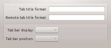
One of the new changes in KDE 4.x since KDE 3.x is the alignment of form and widget labels. In KDE 3.x, labels were aligned to the left and widgets were aligned to the left. In KDE 4, form labels are now aligned to the right and widgets are aligned to the left, making a group of form widgets appear to be center aligned.


Dialog Alignment
In OSX, a group of widgets is center aligned. In KDE4, a group of widgets is left aligned. This aligns the labels closer to the left edge and makes use of space more efficiently.


The alignment of groups of widgets is independent, and so you may have different sized groups with different "centered" lines. A group of widgets consists of widgets within some type of natural separation such as a group box or separator bar.

Checkboxes
Problems with QT 4
The checkbox widget in QT 4 is the input click box on the left and the label on the right. Unfortunately, it difficult to create a checkbox with a label on the right of the input click box. This is a problem because there are common cases when the label on the left of the input click box is better usability. Until there is a resolution that makes configuring the checkbox label to the left of the input click box easier, use the default checkbox alignment (right aligned label), or if possible, put a right-aligned label next to the checkbox, and set the label of the checkbox to "Enabled", "On", or similar.

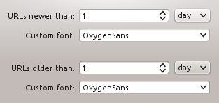
In some cases it may be useful to visually separate groups of related options within one GroupBox to facilitate scanning of the dialog.
In that case, put a vertical fixed size spacer of 16px height between the options.

Examples
[Screenshots of example dialog layouts simple and complex]
