Talk:Projects/Oxygen/StyleWinDec
Appearance
more info at #oxygen irc
- Aligning Group Titles
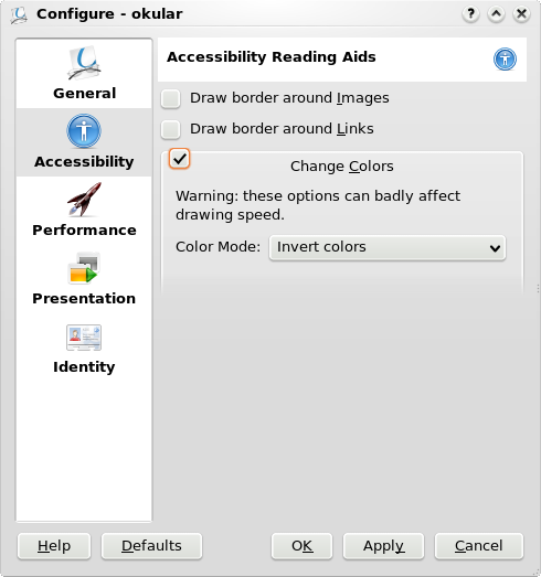
Center aligning group titles breaks the "scanning flow" as the eye has to constantly readjust to a new margin. Left aligning the group titles would increase readability as it allows a faster processing of the group labels. See e.g. http://www.lukew.com/resources/articles/web_forms.html and http://www.uxmatters.com/MT/archives/000107.php. In addition the current implementation breaks group labels that are connected with a checkbox. See example below taken from the Okular settings.

