Projects/Usability/HIG/Toggle Buttons: Difference between revisions
No edit summary |
No edit summary |
||
| Line 8: | Line 8: | ||
Example: A word processor should use toggle buttons to indicate the state of "Bold", "Italic" or "Underline" formatting. | Example: A word processor should use toggle buttons to indicate the state of "Bold", "Italic" or "Underline" formatting. | ||
[[File:Toggle-button-formatting.png]] | |||
(Toggle buttons used in a rich text editor) | |||
==When not to Use== | ==When not to Use== | ||
Revision as of 20:09, 27 August 2010
Definition
A toggle button is a button which stays down when clicked once and goes up when clicked a second time.
When to Use
Use a toggle button to indicate a state.
Example: A word processor should use toggle buttons to indicate the state of "Bold", "Italic" or "Underline" formatting.
![]() (Toggle buttons used in a rich text editor)
(Toggle buttons used in a rich text editor)
When not to Use
Do not use a toggle button to indicate an action.
Example: A music player should not use a toggle button to implement a combined Play/Pause button. It should use a normal button and adjust the icon and label to represent the action which would be performed when clicked.
Icon and Label
There are two ways to label a toggle button:
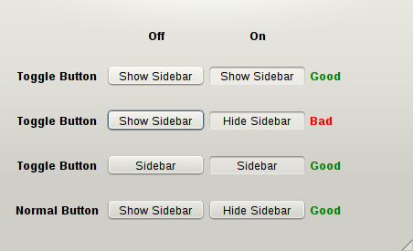
1. Describe the state which is reached when the button is down
In this case the icon and label should not change when the button is down.
For example a button to toggle the visibility of a sidebar could say "Show Sidebar". It should still say "Show Sidebar" when the button is down: it should not be changed to "Hide Sidebar".
If you want to change the button text to "Hide Sidebar" when the sidebar is shown then you should use a normal button, not a toggle button.
An alternative is to reduce the button to a noun if it is not ambiguous. In this example the button label could be reduced to "Sidebar".
2. Describe the current state
In this case the label will often include a passive verb. For example a button to lock or unlock an element would say "Unlocked" when it is up and "Locked" when it is down. The icon should match the label.


