Projects/Usability/HIG/Slider: Difference between revisions
(Added Implementation section) |
|||
| (10 intermediate revisions by 2 users not shown) | |||
| Line 1: | Line 1: | ||
__NOTOC__ | |||
== Purpose == | == Purpose == | ||
A slider | A ''slider'' is a widget with which a user may set a value by moving an indicator, usually in a horizontal fashion. The user may also click on a point on the slider to change the setting. It is different from a scrollbar in that it is typically used to adjust a value without changing the format of the display or the other information on the screen. A slider is used to set defined, contiguous values or a range of discrete values. It is a good choice when values have a relative quantity, not a numeric value. Usually, changes made on the slider are shown immediately. That instant feedback supports input that is not necessarily precise. Compared with spin controls a slider provides faster changes within a larger range but with lower accuracy. Sliders are almost solely operable by mouse. | ||
== Guidelines == | == Guidelines == | ||
* Use a slider when adjusting the value relative to its current value is more important than choosing an absolute | === Is this the right control === | ||
* Use a slider when it is useful for the user to control the rate of change of the value in real time | * Use a slider when adjusting the value relative to its current value is more important than choosing an absolute value. | ||
* Use a slider when it is useful for the user to control the rate of change of the value in real time. | |||
* If the value is open-ended on one or both ends, consider using a [[../Spin_Box|Spin Box]] instead. | * If the value is open-ended on one or both ends, consider using a [[../Spin_Box|Spin Box]] instead. | ||
* Label the slider with a text label | === Behavior === | ||
* | * Try to give immediate feedback while user makes a selection. | ||
* | * Size the control so that a user can easily set the desired value. | ||
* Do not use a non-linear scale, e.g. logarithmic. | |||
=== Appearance === | |||
[[Image:Slider_Mockup2.png]] | |||
* Mark significant values along the length of the slider with text or tick marks. | |||
* Label the minimum and the maximum. | |||
* Label the slider with a text label to its left, using sentence capitalization. Provide an access key in the label that allows the user to give focus directly to the slider. | |||
* Align the label horizontally in line the slider. | |||
* Add the unit to the current value caption, if appropriate. | |||
* Label the range of values; use tick marks and value label; don't label every tick mark. | |||
== Implementation == | == Implementation == | ||
* | * {{qt|QSlider}} | ||
[[ | [[Category:Usability]][[Category:Behavior]][[Category:Editing_and_Manipulation]][[Category:Constrained_input]] | ||
Revision as of 21:11, 31 March 2016
Purpose
A slider is a widget with which a user may set a value by moving an indicator, usually in a horizontal fashion. The user may also click on a point on the slider to change the setting. It is different from a scrollbar in that it is typically used to adjust a value without changing the format of the display or the other information on the screen. A slider is used to set defined, contiguous values or a range of discrete values. It is a good choice when values have a relative quantity, not a numeric value. Usually, changes made on the slider are shown immediately. That instant feedback supports input that is not necessarily precise. Compared with spin controls a slider provides faster changes within a larger range but with lower accuracy. Sliders are almost solely operable by mouse.
Guidelines
Is this the right control
- Use a slider when adjusting the value relative to its current value is more important than choosing an absolute value.
- Use a slider when it is useful for the user to control the rate of change of the value in real time.
- If the value is open-ended on one or both ends, consider using a Spin Box instead.
Behavior
- Try to give immediate feedback while user makes a selection.
- Size the control so that a user can easily set the desired value.
- Do not use a non-linear scale, e.g. logarithmic.
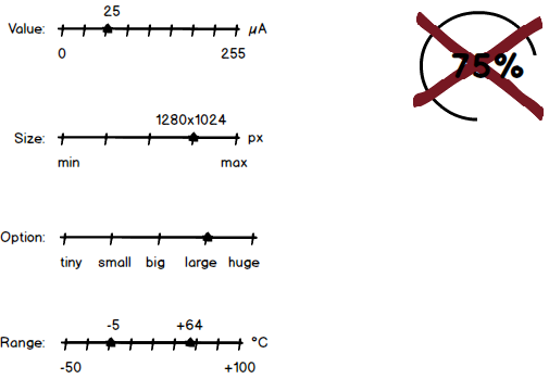
Appearance
- Mark significant values along the length of the slider with text or tick marks.
- Label the minimum and the maximum.
- Label the slider with a text label to its left, using sentence capitalization. Provide an access key in the label that allows the user to give focus directly to the slider.
- Align the label horizontally in line the slider.
- Add the unit to the current value caption, if appropriate.
- Label the range of values; use tick marks and value label; don't label every tick mark.

