Projects/Usability/HIG/SOU Workspace/Picker: Difference between revisions
Beccascollan (talk | contribs) No edit summary |
Beccascollan (talk | contribs) No edit summary |
||
| (5 intermediate revisions by 3 users not shown) | |||
| Line 3: | Line 3: | ||
=== Summary === | === Summary === | ||
A group of items that | A group of items that is displayed regularly but is changed (items being added or removed) only rarely is available to the user. Because of the infrequency of use, save valuable screen space by only showing the full list of items on demand. | ||
=== Solution === | === Solution === | ||
| Line 10: | Line 10: | ||
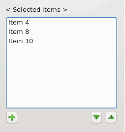
''A list of items from which a picker dialog is launched.'' | ''A list of items from which a picker dialog is launched.'' | ||
* The target list is not directly editable. Provide an "edit" or "add" button at the bottom left of the list. | * The target list is not directly editable. Provide an "edit" or "add" button at the bottom left of the list. | ||
** If the order of available items can be changed, provide up/down buttons to the bottom right of the list. Drag and drop may also be used in addition. | ** If the order of available items can be changed, provide up/down buttons to the bottom right of the list. Drag and drop may also be used in addition. | ||
[[Image:PickerList2.png]] | [[Image:PickerList2.png]] | ||
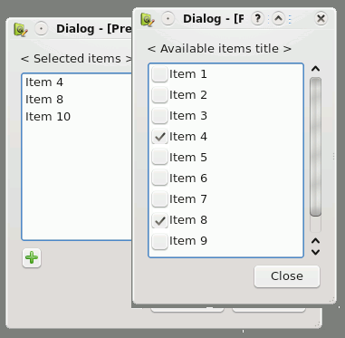
''The Picker Dialog displayed.'' | ''The Picker Dialog displayed.'' | ||
* On clicking the "edit" or "add" button the Picker Dialog is displayed above the target list while ensuring that the target list can still be viewed. | * On clicking the "edit" or "add" button the Picker Dialog is displayed above the target list while ensuring that the target list can still be viewed. | ||
| Line 23: | Line 26: | ||
** the complete list of available items | ** the complete list of available items | ||
** a title of the available items located at the top of the list | ** a title of the available items located at the top of the list | ||
** a checkbox for each item to the left of the item name (see [[Rich Lists]] if more information must be displayed) | ** a checkbox for each item to the left of the item name (see [[../Rich Lists|Rich Lists]] if more information must be displayed) | ||
** a close button to the bottom right of the dialog | ** a close button to the bottom right of the dialog | ||
* Upon selecting a checkbox the item is immediately displayed in the target list. | * Upon selecting a checkbox the item is immediately displayed in the target list. | ||
Example image: | |||
[[Image:Picker.png]] | |||
=== Related Patterns: === | === Related Patterns: === | ||
[[Edit Lists]]; [[Two Lists with Arrow Buttons]] | [[../Edit Lists|Edit Lists]]; [[../Two Lists with Arrow Buttons|Two Lists with Arrow Buttons]] | ||
Revision as of 20:31, 3 September 2008
Picker Dialog
Summary
A group of items that is displayed regularly but is changed (items being added or removed) only rarely is available to the user. Because of the infrequency of use, save valuable screen space by only showing the full list of items on demand.
Solution
A list of items from which a picker dialog is launched.
- The target list is not directly editable. Provide an "edit" or "add" button at the bottom left of the list.
- If the order of available items can be changed, provide up/down buttons to the bottom right of the list. Drag and drop may also be used in addition.
The Picker Dialog displayed.
- On clicking the "edit" or "add" button the Picker Dialog is displayed above the target list while ensuring that the target list can still be viewed.
- The Picker Dialog includes:
- the complete list of available items
- a title of the available items located at the top of the list
- a checkbox for each item to the left of the item name (see Rich Lists if more information must be displayed)
- a close button to the bottom right of the dialog
- Upon selecting a checkbox the item is immediately displayed in the target list.
Example image:


