Projects/Usability/HIG/GlobalDrawer
Menu Drawer
Purpose
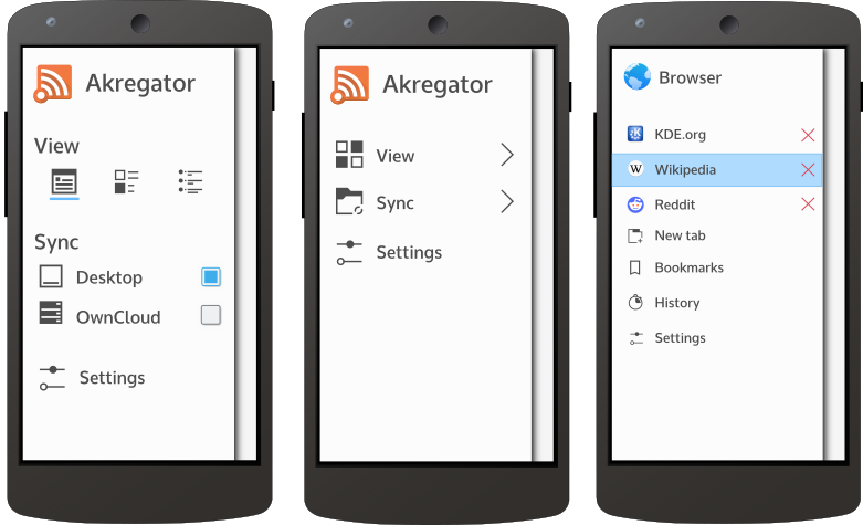
The Menu Drawer is a standard element in KDE mobile applications. It contains an application's main menu, and any functions which are not part of the application's main usecases but are not specific to the current context either.
Is this the right control?
Use a Menu Drawer whenever your application has any functions which are not central enough to the application's main purpose to put them in the main user interface, and which are not dependent on the current context. For context-specific actions (e.g. those affecting a selected item), use the Context Drawer
Guidelines
The menu drawer is opened by swiping in from the left or right edge of the screen (depending on a system-wide setting) and closed by swiping in the other direction or tapping outside of it.
A Menu Drawer may contain the following controls:
- Tabs
- A main menu
- Push Buttons to execute non-contextual actions
- Checkboxes or Radio Buttons to change settings which are commonly changed
The main menu
- Must not have more than three levels
- Should if possible not contain more elements than fit on the screen
- Should contain an entry "Settings" in the last position if the application has settings which are not commonly changed
- In lower menu levels, below the entries there is a button to go up one level.
Do not use the Menu Drawer for navigation purposes.

