Projects/Usability/HIG/Color: Difference between revisions
(Created page with "==Purpose== ==Guidelines== * Choose colors by selecting the appropriate theme color or system color. * Never use color as a primary method of communication, but as a secondary...") |
m (→Guidelines) |
||
| (11 intermediate revisions by 4 users not shown) | |||
| Line 1: | Line 1: | ||
==Purpose== | ==Purpose== | ||
Color is a basal quality in human perception. Color can be used for communication, it is a very efficient way to direct attention, and significance can be assigned to an object with color. However, color is a historical and cultural phenomenon, and is subject of continuous aesthetical changes. Furthermore, it should be taken into consideration that a rather high percentage of population has a perception disorder ranging from difficulties to discriminate between red and green to complete color blindness. | |||
A consistent color set helps create a familiar visual language throughout the user interface. | |||
==Guidelines== | ==Guidelines== | ||
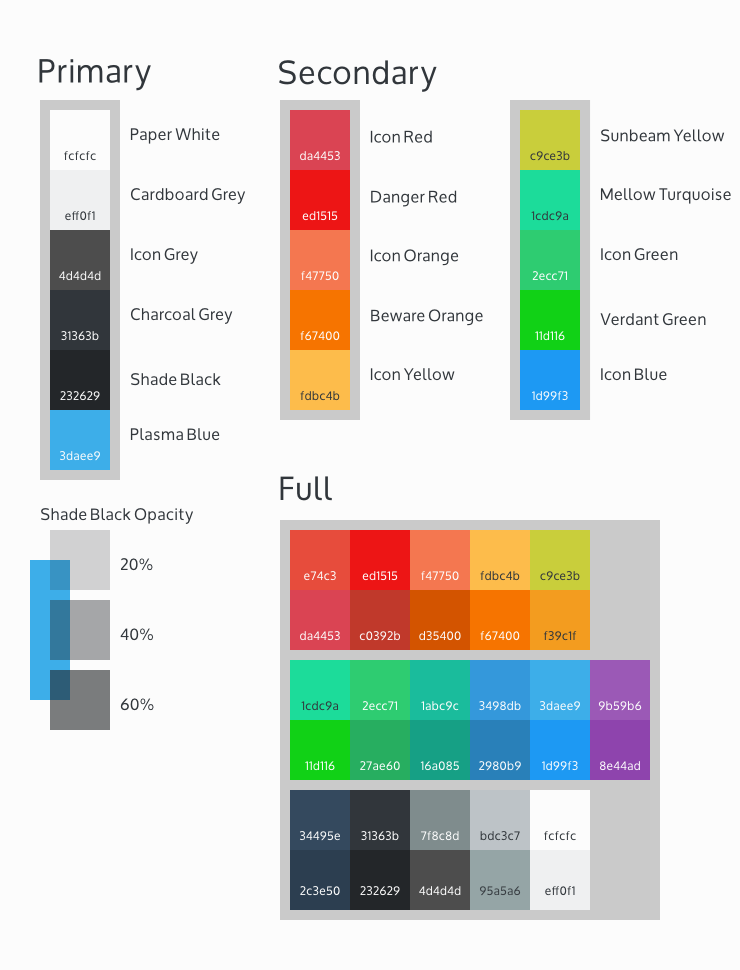
* | [[File:Breeze Color Palette.png|frame|none|alt=Alt text|Breeze Color Palette]] | ||
* | * While the system color theme can be selected by the user, the Breeze color palette (above) is used for the reference visual design of KDE Applications and Workspaces, and make up the default system color theme. | ||
* | ** Primary colors are used throughout the main interface of the applications and workspaces. '''Plasma Blue''' is used as the primary highlight color. | ||
* Consider accessibility for users with color vision deficiency (~5% population). | ** Secondary colors are used sparingly as accents throughout the visual design. | ||
** Where transparency is used (e.g. shadows) consider using the opacities listed. | |||
* Avoid using color as a primary method of communication. Color is best used as secondary method to reinforce meaning visually. | |||
* Ensure sufficient contrast between foreground and background colors. | |||
* Consider accessibility for users with color vision deficiency (~5% population). Use one of the many available online color blindness simulators to ensure colors intended to be distinguishable remain distinguishable for color-blind users. | |||
==Implementation== | ==Implementation== | ||
* When implementing colors in your application, select the appropriate theme color or system color from the palette provided by the Qt or KDE Platform/Frameworks library. You can use the [http://kde-look.org/content/show.php/CheckColorRoles?content=90034 CheckColorRoles] theme to detect bugs regarding the use of system colors in your application. | |||
* [http://api.kde.org/frameworks-api/frameworks5-apidocs/kconfigwidgets/html/classKColorScheme.html KColorScheme] provides methods to pick the colors from the system color scheme to avoid hardcoding colors where possible. | |||
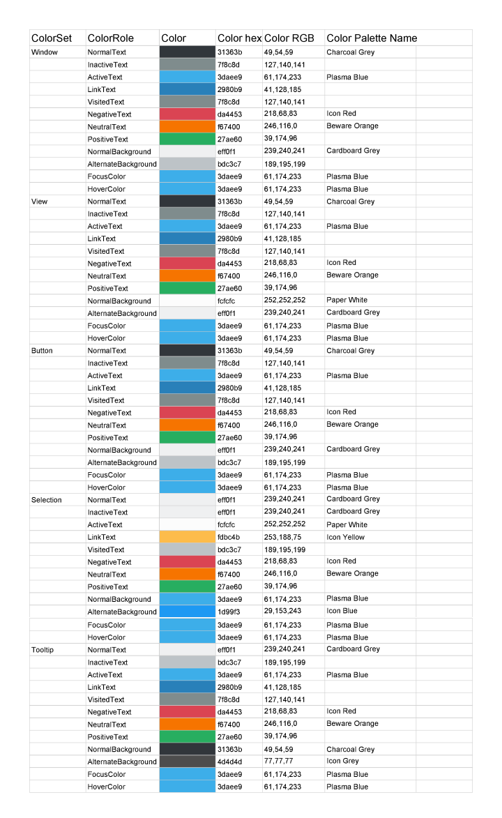
* Color Mapping - The Breeze color palette maps to the KColorScheme color roles as shown below: | |||
[[File:Color mapping.png]] | |||
[[Category:Usability]][[Category: Presentation]] | |||
Revision as of 17:41, 4 October 2014
Purpose
Color is a basal quality in human perception. Color can be used for communication, it is a very efficient way to direct attention, and significance can be assigned to an object with color. However, color is a historical and cultural phenomenon, and is subject of continuous aesthetical changes. Furthermore, it should be taken into consideration that a rather high percentage of population has a perception disorder ranging from difficulties to discriminate between red and green to complete color blindness.
A consistent color set helps create a familiar visual language throughout the user interface.
Guidelines

- While the system color theme can be selected by the user, the Breeze color palette (above) is used for the reference visual design of KDE Applications and Workspaces, and make up the default system color theme.
- Primary colors are used throughout the main interface of the applications and workspaces. Plasma Blue is used as the primary highlight color.
- Secondary colors are used sparingly as accents throughout the visual design.
- Where transparency is used (e.g. shadows) consider using the opacities listed.
- Avoid using color as a primary method of communication. Color is best used as secondary method to reinforce meaning visually.
- Ensure sufficient contrast between foreground and background colors.
- Consider accessibility for users with color vision deficiency (~5% population). Use one of the many available online color blindness simulators to ensure colors intended to be distinguishable remain distinguishable for color-blind users.
Implementation
- When implementing colors in your application, select the appropriate theme color or system color from the palette provided by the Qt or KDE Platform/Frameworks library. You can use the CheckColorRoles theme to detect bugs regarding the use of system colors in your application.
- KColorScheme provides methods to pick the colors from the system color scheme to avoid hardcoding colors where possible.
- Color Mapping - The Breeze color palette maps to the KColorScheme color roles as shown below:

