Reusable QML components
Introduction
This article would explain some reusable QML components - how they are implemented and their usage. If you wish to write some reusable QML components then you might be interested to read my approach to implement them. However, if you just want to use the components in your QML apps / games - you can just read the usage part of the components. These components were originally written by me as a part of KDiamond QML version game.
List dialog
A list dialog provides a dialog box with a list of items to choose from. Basically, a dialog that prompts for one element out of a list of elements.
Basic Structure of List dialog
Here is the basic skeleton for list dialog. We have the listdialog Rectangle as the main container / parent and dialog Rectangle as a child. listdialog Rectangle would provide a semi-transparent background for the dialog. The dialog Rectangle contains the ListView - which would be used for displaying the list of elements in the dialog.
Rectangle{
    id: listdialog

    Rectangle{
        id: dialog

      ListView{
            id: dialoglist

		}

	  Text {
            id: dialogtitle

        }

      Rectangle{
            id: dialogline

        }
    }
}
listdialog also implement a MouseArea for dismissing the dialog when clicked. Essentially, the MouseArea would just contain a line of code to turn the opacity of the dialog to 0, so that it is not visible and thus dismissed. Dialog animations /transitions can be added in this mouse area as well.
dialogtitle is a text element which would act as the tile of the dialog. We would like this text to be dynamically assigned, hence we would need to expose the text property of dialogtitle through our component. This can be done by using property alias for dialogtitle.text
property alias dialogtitle: dialogtitle.text
ListView for List dialog
The ListView in our dialog would require a model and a delegate. Since we are designing the dialog as a reusable component - we would like to allow the model to be supplied from outside the component. So we expose the model of the ListView by setting a property alias for it.
property alias dialogModel: dialoglist.model
We then define the delegate for our ListView. This delegate would define how each list item would look on the ListView. After adding our delegate our ListView would look like below,
ListView{
	id: dialoglist
	width: parent.width
	spacing: margin
	height:model.count*(listitem_height+spacing)
	interactive: false
	anchors.top: dialogline.bottom
	anchors.topMargin: margin
	model: mymodel
	onModelChanged: {
		dialoglist.height = dialoglist.model.count*(listitem_height+spacing)
	}

	delegate: Rectangle{
		id: listitem
		width: parent.width - 50
		height: listitem_height
		radius: 10
		anchors.horizontalCenter: parent.horizontalCenter
		color: "teal"

			Text {
				id: listitemText
				text: name
				anchors.centerIn: parent
				font.pixelSize: 14
				color: "white"
			}
		}
	}
}
We've used the onModelChanged event handler to dynamically assign the height of the ListView. This is useful when the model of the dialog is changed. The height of the dialog ListView is recalculated with the help of this event handler.
After this, the ascestetics have been taken care of. However, we still need to add a MouseArea to the delegate (list item) - we need to then emit a signal describing which item has been clicked. For this we would implement a clicked signal in the component,
signal clicked (string item_string, int index)
The clicked signal would emit both - the item index as well as them item string. The MouseArea would look something like this,
MouseArea{
	id: delegateMouseArea
	anchors.fill: parent
	onClicked: {
		listdialog.clicked(name, index)
	}
}
Animating the dialog
To animate the list dialog when it appears and is dismissed, we use PropertyAnimation. PropertyAnimation provides a way to animate changes to a property's value. Here, we would like to animate the "opacity" property of the listdialog hence, we have used two PropertyAnimations.
   PropertyAnimation { id: showDialog; target: listdialog; property: "opacity"; to: 1; duration: 500; easing.type: Easing.InQuad}
   PropertyAnimation { id: hideDialog; target: listdialog; property: "opacity"; to: 0; duration: 500; easing.type: Easing.OutQuad}
The above two animations can be sumarized as below,
- showDialog which will change the opacity from 0 to 1 in an InQuad pattern
- hideDialog which will change the opacity from 1 to 0 in an OutQuad pattern
The duration for each animation is 500 milliseconds. Also, we need to expose these animations to show and hide the dialog with animations. We do this by adding alias for both the animations.running state.
property alias showDialog: showDialog.running
property alias hideDialog: hideDialog.running
Usage for List dialog
Using the List dialog is really simple. After adding the component to your project, you can add a list dialog in your main.qml by the following piece of code. You can define a simple list model to go with your list dialog, as I have done below.
// Model for new game dialog
ListModel{
	id: newgameModel
	ListElement{
		name: "Timed game"
	}
	ListElement{
		name: "Untimed game"
	}
}

Listdialog{
	id: newgameDialog
	dialogtitle: "New Game"
	dialogModel: newgameModel
	opacity: 0
	onClicked: {
		// Put your logic here! Below is my logic from KDiamond QML version.

		/* New game started */
		MainWindow.newGameButton_clicked(index);

		// Dismiss new game dialog
		newgameDialog.hideDialog= true;

		// Hide pop ups if any
		hidePopup()
	}
}
- To show the dialog use: newgameDialog.showDialog = true
- To hide the dialog use: newgameDialog.hideDialog = true
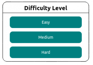
Example of ListDialog as appearing in KDiamond for Difficulty Level

