Projects/Oxygen/Style
Working ground for the Oxygen Icon Style Guide.
Here you will find the newest info on the Oxygen Icon Style Guide.
Note that until now this is still a study of work in motion
Templates for different icon sizes
For different sizes of icons, different line/stroke widths and different shape ratio's need to be adhered to in order to render the optimum file at a given size.
Although the set it SVG we are creating different SVG files to render certain sizes. Basically, at this time we are using 128x128 templates for all icons down to and including 48x48.
Note that in icons below 48x48 (ie. anything on smaller than 128x128 template) need to have points/lines/strokes which lie directly on a pixel raster/grid.
32x32 icons are being drawn on a 88x88 template. Be sure to make all lines/strokes 4 pixels in width and all shapes a factor of 4.
The smaller sizes at this time are being drawn at the actual size (ie 22x22 and 16x16) although this is not really a rule and will change once we figure it out :p
Color Usage
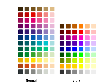
Oxygen has a distinct, defined palette which should always be adhered to.
Download the file here: The Oxygen Palette
Metaphors/Styles for different icon types
Actions
Action Icons have a distinct shadow (example and explanation needed)
Applications
Application icons vary the most in style from cartoonish logos to photo-realistic (example and explanation needed)
Mimetypes
Mimetypes all use the same paper sheet template (example and explanation needed)
Devices
Devices are the most realistic of all icons (example and explanation needed)
Filesystems
Filesystem icons vary in style depending on whether the subject at hand can be defined by a physical object (example and explanation needed)

