Projects/Oxygen/Style: Difference between revisions
No edit summary |
Expanded or rewritten a lot of things |
||
| Line 1: | Line 1: | ||
=Oxygen Icon Style Guide= | |||
{{warning|'''The Oxygen Icon Style is currently a work in progress:''' This is the newest version, but several sections need expanding.}} | |||
' | == Oxygen's Approach to Icon Sizes == | ||
Oxygen icons are all scalable vector graphics (SVG) documents, which is the default format used by [http://inkscape.org Inkscape]. These SVG files are used to render bitmap images (PNG) at various sizes. | |||
'' | Oxygen uses the 128x128 'pixel' SVG files to produce icons at 5 different sizes: 128x128, 64x64, 48x48, 32x32 and 16x16 pixel images. 88x88 'pixel' SVG files are used to render at 22x22 pixels. | ||
For icons that are designed to be rendered at 32x32, 22x22 and 16x16 it is crucial that icons have a noticeable outline, to improve legibility. | |||
=== 16x16 === | |||
*Use the [http://websvn.kde.org/*checkout*/trunk/playground/artwork/Oxygen/templates/action_32x32.template.svg 32x32 template] | |||
*Set the grid to 8 pixels | |||
*Preview the icon by zooming out to 13% | |||
=== 22x22 === | |||
*Use the [http://websvn.kde.org/*checkout*/trunk/playground/artwork/Oxygen/templates/action_22x22.template.svg 22x22 template]. | |||
*Set the grid to 4 pixels | |||
*Preview the icon by zooming out to 25% | |||
[http://websvn.kde.org/*checkout*/trunk/playground/artwork/Oxygen/templates/ | === 32x32 === | ||
*Use the [http://websvn.kde.org/*checkout*/trunk/playground/artwork/Oxygen/templates/action_32x32.template.svg 32x32 template] | |||
*Set the grid to 4 pixels | |||
*Preview the icon by zooming out to 25% | |||
== Color Usage == | == Color Usage == | ||
| Line 23: | Line 30: | ||
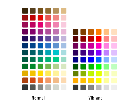
[[Image:figure4.png]] | [[Image:figure4.png]] | ||
{{Note| | |||
[http:// | The Oxygen color palette is released under the [http://creativecommons.org/licenses/by-nc-nd/2.5/ Creative Commons Attribution-NonCommercial-NoDerivs 2.5 License].}} | ||
You can easily use the Oxygen Colour scheme by downloading the palette. To download the Oxygen Palette [http://websvn.kde.org/*checkout*/trunk/playground/artwork/Oxygen/utils/oxygen.gpl Click here] | |||
# | |||
#Close Inkscape, if you have it running | |||
# | #Place [http://websvn.kde.org/*checkout*/trunk/playground/artwork/Oxygen/utils/oxygen.gpl 'oxygen.gpl'] in this folder: {{path|~/.inkscape/palettes/}} | ||
#Start Inkscape | |||
#Select the Oxygen palette in the Swatches dialog (Ctrl+Shift+W). | #Select the Oxygen palette in the Swatches dialog (Ctrl+Shift+W). | ||
== Metaphors/Styles for different icon types == | |||
=== Actions === | |||
Action icons require a distinctive 1 pixel solid outline. Action icons are drawn to appear as they are on a shelf. This means that a small shadow is drawn directly beneath the icon. | |||
The templates linked above include this shadow, therefore consistancy is ensured. | |||
=== Applications === | |||
Application icons vary the most in style from cartoonish logos to photo-realistic (example and explanation needed) | Application icons vary the most in style from cartoonish logos to photo-realistic (example and explanation needed) | ||
=== Mimetypes === | |||
Mimetypes all use the same paper sheet template (example and explanation needed) | Mimetypes all use the same paper sheet template (example and explanation needed) | ||
=== Devices === | |||
Devices are the most realistic of all icons (example and explanation needed) | Devices are the most realistic of all icons (example and explanation needed) | ||
''' | === Places === | ||
Places icons vary in style depending on whether the subject at hand can be defined by a physical object. | |||
=== Emblems === | |||
Emblems are icons overlaid on top of other icons. Examples of Emblems are the "'link arrow' and the 'mounted star' symbol. These icons should be noticeable but not detract and cover too much of the icon beneath them. | |||
{{Box|Emblem|[[Image:Oxygen-128-emblem-mounted.png|center]] | |||
''The mounted emblem uses the vibrant colours from the Oxygen palette. The form of the icon itself is very simple and clear.''}} | |||
[[Category:Artwork]][[Category:Oxygen]] | [[Category:Artwork]][[Category:Oxygen]] | ||
Revision as of 19:57, 24 April 2007
Oxygen Icon Style Guide

Oxygen's Approach to Icon Sizes
Oxygen icons are all scalable vector graphics (SVG) documents, which is the default format used by Inkscape. These SVG files are used to render bitmap images (PNG) at various sizes.
Oxygen uses the 128x128 'pixel' SVG files to produce icons at 5 different sizes: 128x128, 64x64, 48x48, 32x32 and 16x16 pixel images. 88x88 'pixel' SVG files are used to render at 22x22 pixels.
For icons that are designed to be rendered at 32x32, 22x22 and 16x16 it is crucial that icons have a noticeable outline, to improve legibility.
16x16
- Use the 32x32 template
- Set the grid to 8 pixels
- Preview the icon by zooming out to 13%
22x22
- Use the 22x22 template.
- Set the grid to 4 pixels
- Preview the icon by zooming out to 25%
32x32
- Use the 32x32 template
- Set the grid to 4 pixels
- Preview the icon by zooming out to 25%
Color Usage
Oxygen has a distinct, defined palette which should always be adhered to.

You can easily use the Oxygen Colour scheme by downloading the palette. To download the Oxygen Palette Click here
- Close Inkscape, if you have it running
- Place 'oxygen.gpl' in this folder: ~/.inkscape/palettes/
- Start Inkscape
- Select the Oxygen palette in the Swatches dialog (Ctrl+Shift+W).
Metaphors/Styles for different icon types
Actions
Action icons require a distinctive 1 pixel solid outline. Action icons are drawn to appear as they are on a shelf. This means that a small shadow is drawn directly beneath the icon.
The templates linked above include this shadow, therefore consistancy is ensured.
Applications
Application icons vary the most in style from cartoonish logos to photo-realistic (example and explanation needed)
Mimetypes
Mimetypes all use the same paper sheet template (example and explanation needed)
Devices
Devices are the most realistic of all icons (example and explanation needed)
Places
Places icons vary in style depending on whether the subject at hand can be defined by a physical object.
Emblems
Emblems are icons overlaid on top of other icons. Examples of Emblems are the "'link arrow' and the 'mounted star' symbol. These icons should be noticeable but not detract and cover too much of the icon beneath them.


