Projects/Oxygen/ColorSchemes: Difference between revisions
(→Colors) |
(→Colors) |
||
| Line 17: | Line 17: | ||
* Normal Background (BackgroundNormal) | * Normal Background (BackgroundNormal) | ||
* Alternate (BackgroundAlternate) | * Alternate (BackgroundAlternate) | ||
* Normal Text ( | * Normal Text (ForegroundNormal) | ||
* Inactive Text (ForegroundInactive} | * Inactive Text (ForegroundInactive} | ||
* Active Text (ForegroundActive) | |||
* Link Text (ForegroundLink) | * Link Text (ForegroundLink) | ||
* Visited Text (ForegroundVisited} | * Visited Text (ForegroundVisited} | ||
* Negative Text (ForegroundNegative) | * Negative Text (ForegroundNegative) | ||
* Neutral Text (ForegroundNeutral) | * Neutral Text (ForegroundNeutral) | ||
* Positive Text (ForegroundPositive) | |||
ForegroundPositive | * Focus Decoration (DecorationFocus) | ||
* Hover Decoration (DecorationHover) | |||
(DecorationFocus) | |||
DecorationHover | |||
making a total of 60 named colors. | making a total of 60 named colors. | ||
Latest revision as of 12:27, 25 March 2008
KDE4 introduces some major changes in color schemes. Here you will find an overview of some new color-related features, as well as a preview of the new color schemes.
This should probably go somewhere better (like, "the documentation"?). For now techbase (with winterz' "highly-unofficial" permission) is being abused as a dumping ground for screenshots, in order to try to solicit feedback from kde-artists.
Colors
KDE4 includes more named colors then KDE3 had. These are divided into 5 groups:
- View
- Window
- Button
- Selection
- Tooltip
which each contain 12 named colors:
- Normal Background (BackgroundNormal)
- Alternate (BackgroundAlternate)
- Normal Text (ForegroundNormal)
- Inactive Text (ForegroundInactive}
- Active Text (ForegroundActive)
- Link Text (ForegroundLink)
- Visited Text (ForegroundVisited}
- Negative Text (ForegroundNegative)
- Neutral Text (ForegroundNeutral)
- Positive Text (ForegroundPositive)
- Focus Decoration (DecorationFocus)
- Hover Decoration (DecorationHover)
making a total of 60 named colors.
Effects
KDE4 introduces "state effects"; three effects that can be applied to inactive windows, and disabled widgets.
- Intensity
- Allows adjusting the overall brightness. 'shade' adjusts luma by an absolute amount (-1.0 to 1.0), 'darken' and 'lighten' adjust by a percentage, where negative percentages are allowed (e.g. -50% results in new_luma = 1.5 * old_luma).
- Color
- Allows adjusting the overall color, either by multiplying the chrome ('desaturate' - again, negative values are allowed, which results in increasing the chroma), mixing with another color ('fade'), or tinting with another color ('tint'). Tinting tends to change hue/chroma much more rapidly while preserving luma.
- Contrast
- Allows adjusting only foreground colors, so that e.g. text becomes less prominent. The effects are 'fade' and 'tint'; the background color is used as the target.
NOTE: Inactive effects cause additional window repaints that some people may find annoying, or may cause performance problems on older machines.
Options
- Apply inactive window color effects
- The built-in color schemes define inactive effects. If you do not wish to use them, this provides an easy way to turn them off. (default=off)
- Inactive selection changes color
- KDE4 strives to join the rest of the world by using a different color for selection in widgets that do not have focus, enhancing Usability. Due to performance concerns, the default is off until these can be addressed, hopefully in Qt 4.5, but if you have a good computer, you are strongly encouraged to try enabling this.
- Because inactive window effects incur the performance penalty anyway, checking 'apply inactive window color effects' will enable this option if it has not been manually clicked (similarly, unchecking said option will disable this one in the same situation).
- Shade sorted column in lists
- This is currently not implemented by listviews :-(.
- Contrast
- This controls the strength of 3D effects.
Schemes
The author (Matthew Woehlke, also the creator of all of these color schemes, with varying levels of inspiration or blatant copying) apologizes for the marketing spiel you are about to be subjected to if you read this section ;-).
Blue Deep
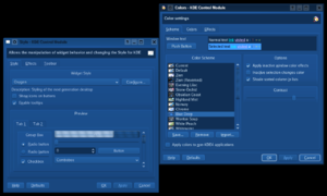
Rich blues, vibrant yet soothing, threaten to pull you into the watery depths of this scheme. This is a port of the KDE3 scheme Dark Blue.
Cherry Blossom
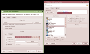
Soft, light pinks touched with green bring a gentle, eastern feel to this scheme reminiscent of the famous tree.
Chrome
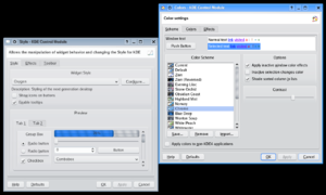
Bright, shiny gray with just a touch of blue, combined with vibrant blue accents, conjures the feel of polished metal, as well as memories of Keramik and Plastik schemes from KDE3.
Desert
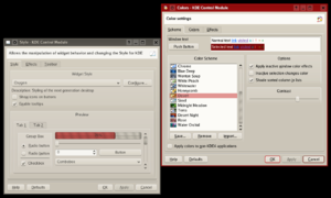
Soft shades of sand are accented by rich red. This scheme is a port of the KDE3 scheme by the same name.
Evening Lilac
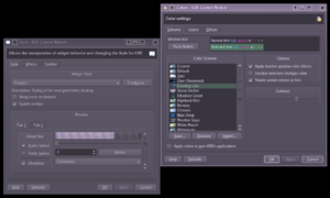
Dusty gray-purple with touches of green bring to mind a lilac bush on a warm summer night.
Highland Mist
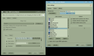
Pale shades of green with a touch of blue accents evoke images of grass-covered hills shrouded in fog.
Honeycomb
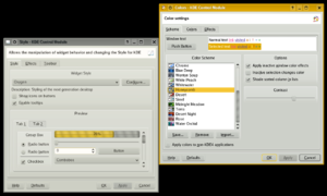
Soft shades of gray touched by yellow mix with honey-colored highlights to give an impression of bees, or perhaps BeOS.
Midnight Meadow
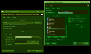
Dark shades of green shimmer with unearthly light in this scheme inspired by the glow of a sea of lush green grass in the deep of night.
Norway
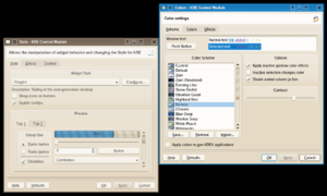
Kudos if you can figure out the reference here. Due to questionable content, it will not be posted ;-). This scheme added at the request of Eike Hein, and inspired by Charamel for Firefox
Obsidian Coast
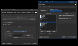
Inspired by movies of dark waves breaking against tall, black cliffs, this scheme (a dark version of Whitewater) is perfect for those that love a sense of foreboding, or just the rich, natural look of volcanic glass.
Steel
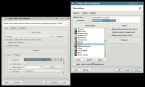
Warm gray, subtle gold, and striking cyan come together in a warm industrial tribute to classic skyscrapers in the late afternoon sun.
Stone Orchid
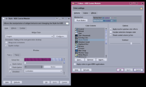
Rich gray with a hint of floral meets soft cyan and vibrant royal-purple accents in this scheme inspired by orchids, and KDE3's Solaris.
Terra
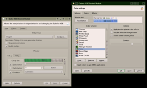
Gray mingled with green joins blue accents in this outdoor scheme inspired by grass and rocks against a clear sky.
White Peach
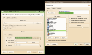
Inspired by a juice label, this scheme brings vibrant, light peachy tones reminiscent of juice by the same name, and welds it with floral green accents.
Whitewater
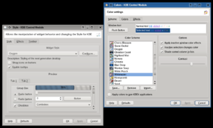
Calling to mind the river canyons of Colorado, this neutral scheme features a solid earthy/rocky gray base with blue accents.
Wonton Soup
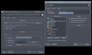
Created from the KDE3-era wallpaper of the same name, this scheme was made by Matthew Woehlke, who uses (and has used, for about two years) it as his KDE3 scheme.
Zion
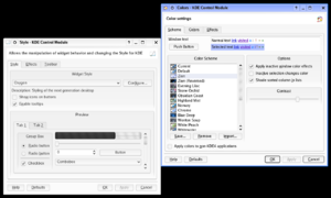
Reminiscent of the computers in the fictional city of the same name from the Matrix trilogy, this scheme features mainly black foreground elements on a starkly white background. It is included in kdeaccessibility and is intended to aid users with visual difficulties.
Zion (Reversed)
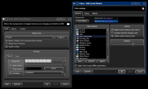
An inverse of the Zion scheme, this provides white-on-black elements, again maximizing contrast.
